Synthetic Dashboards
Synthetic Overview
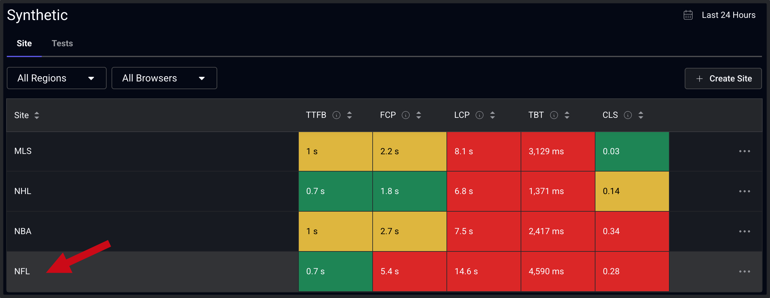
The Synthetic Sites view is the primary entry point for understanding synthetic performance across all of the sites you are monitoring. It presents a site level comparison of key Web Vitals metrics: TTFB, FCP, LCP, TBT, and CLS. This view can be filtered by regions and browsers for the selected time window. From this view, teams can quickly identify which sites are underperforming and drill down into each site to begin to isolate root cause. Clicking on a cell continues the investigation into site performance.
Site Dashboard
The site overview provides a consolidated view of synthetic performance for a single site, aggregating results across all configured pages, regions, and browsers. Summary indicators highlight which Web Vitals fall outside acceptable thresholds. In this example, strong TTFB alongside poor FCP, LCP, and TBT suggests that performance problems are occurring after the initial response, likely due to blocking or slow resources in the critical rendering path as well as potential issues with JavaScript execution. This view helps teams confirm whether issues are isolated or site-wide before drilling into individual pages.
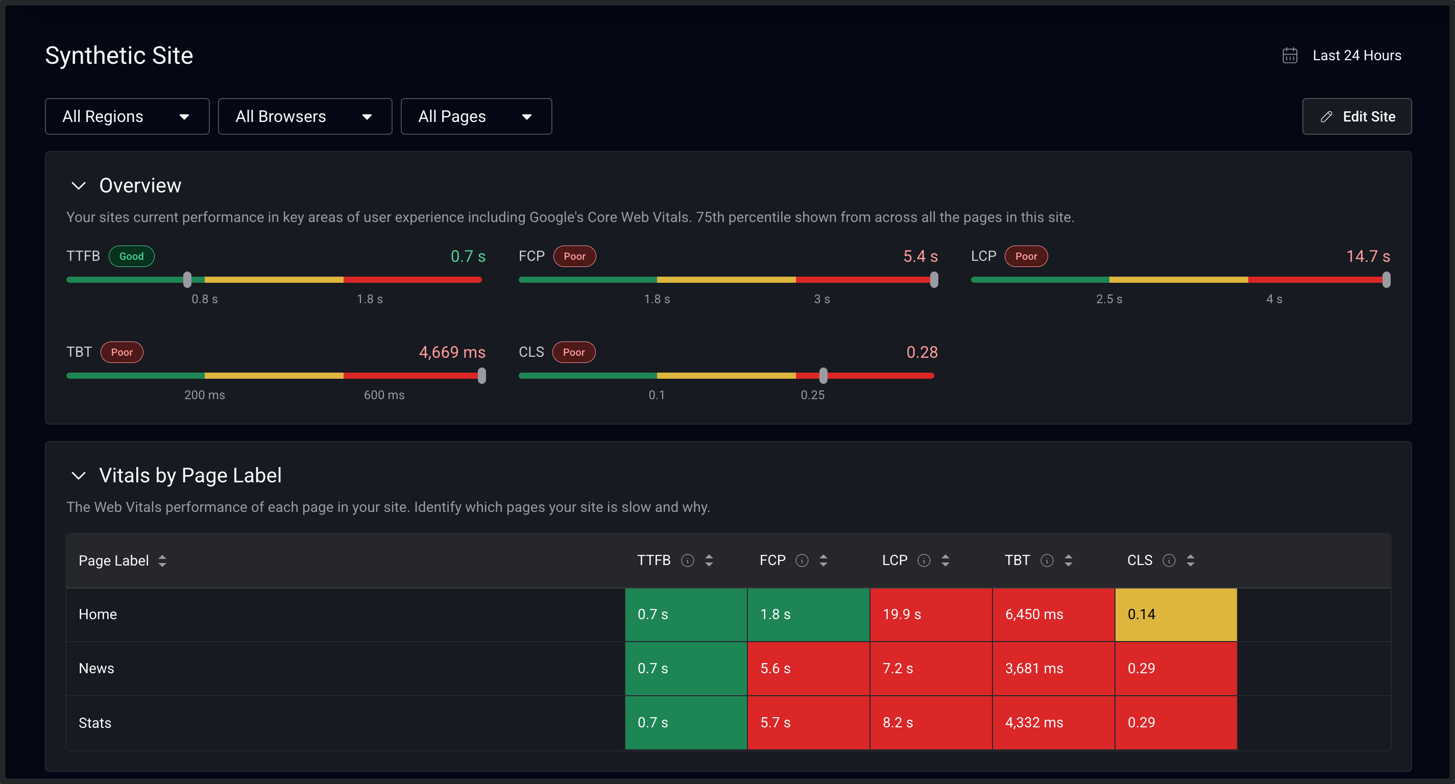
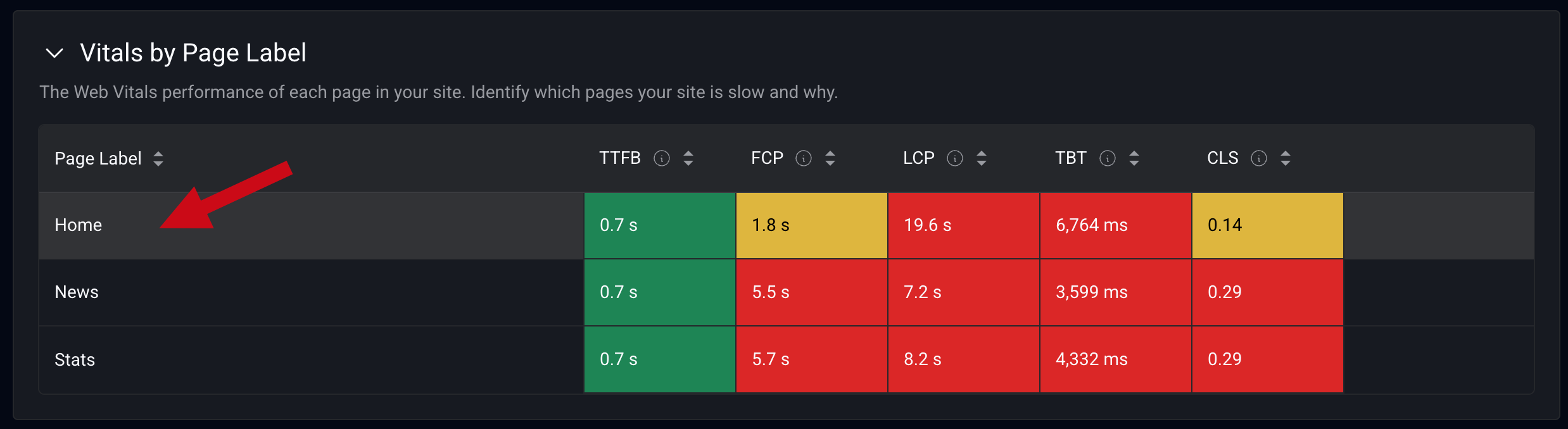
The Vitals by Page Label table breaks down synthetic performance by page, allowing teams to identify which pages are contributing most to poor performance. Pages with significantly worse LCP, TBT, or CLS can be quickly identified and prioritized for further analysis. Selecting a page transitions the investigation from a site view to page specific diagnostics (next).
Pages Dashboard
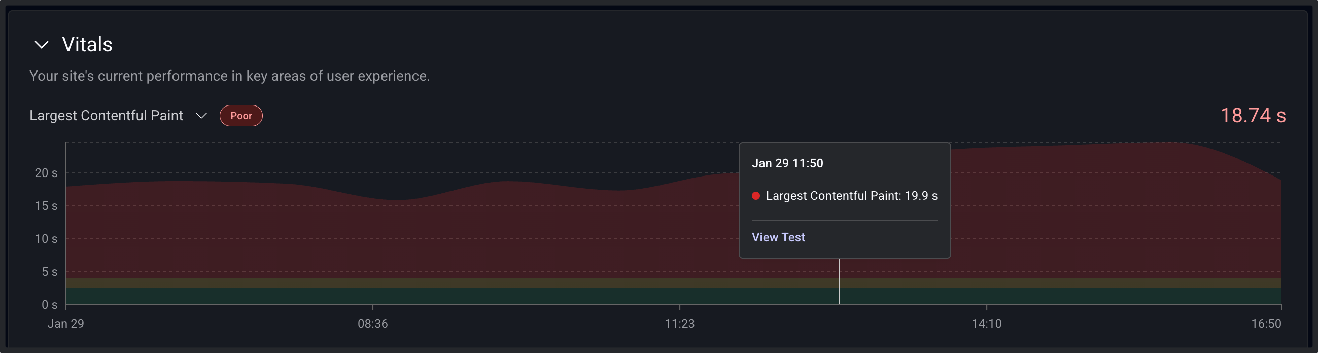
The page level view focuses on a single page’s synthetic performance. This view provides the context needed to determine whether optimization efforts should focus on page construction, JavaScript, or third-party resources. Time series charts show how individual performance metrics change over time. Engineers can correlate changes in performance with deployments, configuration changes, or traffic patterns.
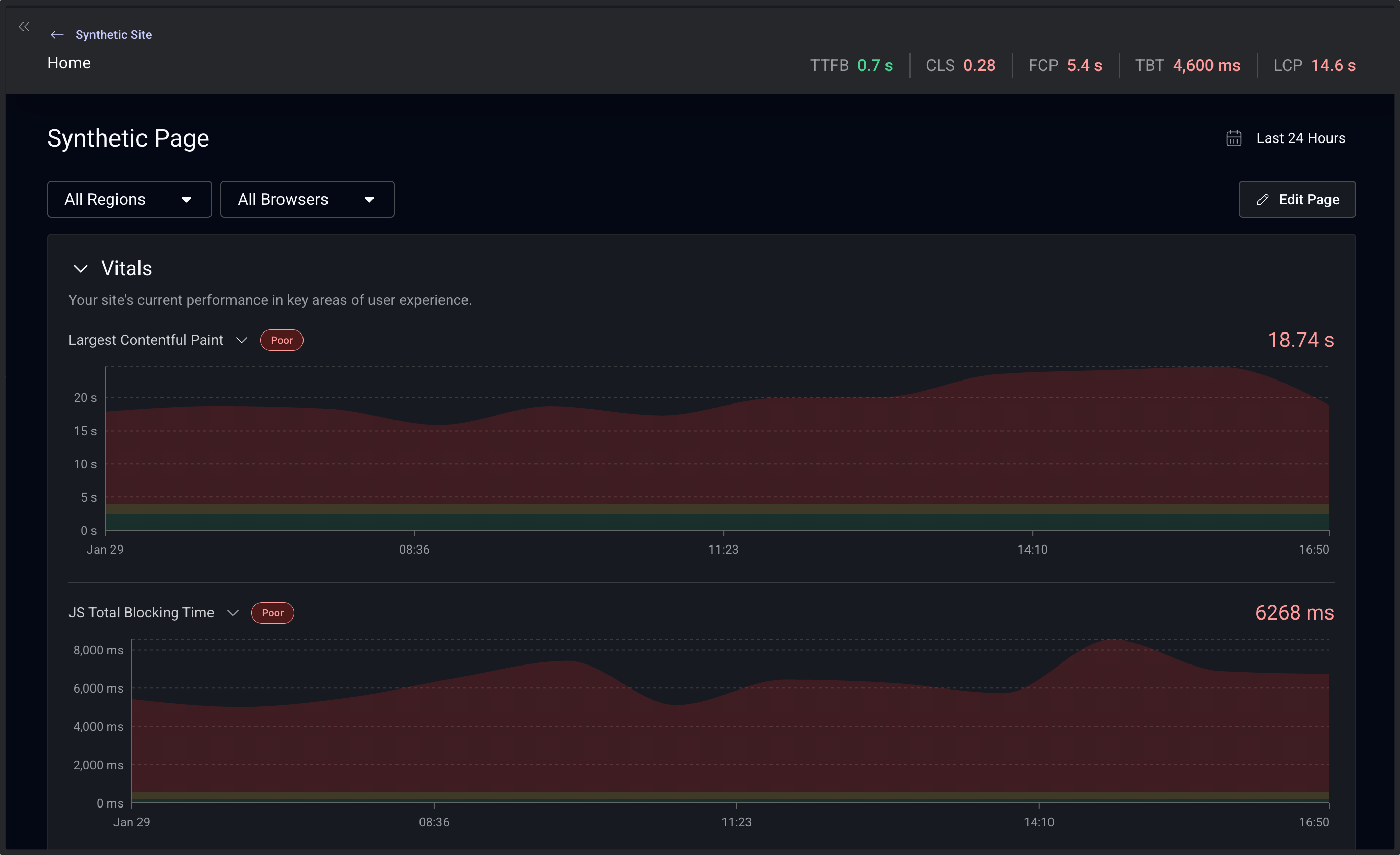
Individual data points link directly to the underlying synthetic test details, enabling rapid transition from trend analysis to detailed diagnostics. Other details on the pages dashboard include rendering metrics, filmstrips, CPU impact, and even Lighthouse test scores and audits.
Synthetic Test Details
The test details view lists the individual results that make up the aggregated metrics seen previously. The comprehensive diagnostics include filmstrips, waterfall, JavaScript, and third-party impact. This view gives users the ability to identify exactly what is impacting the user experience.
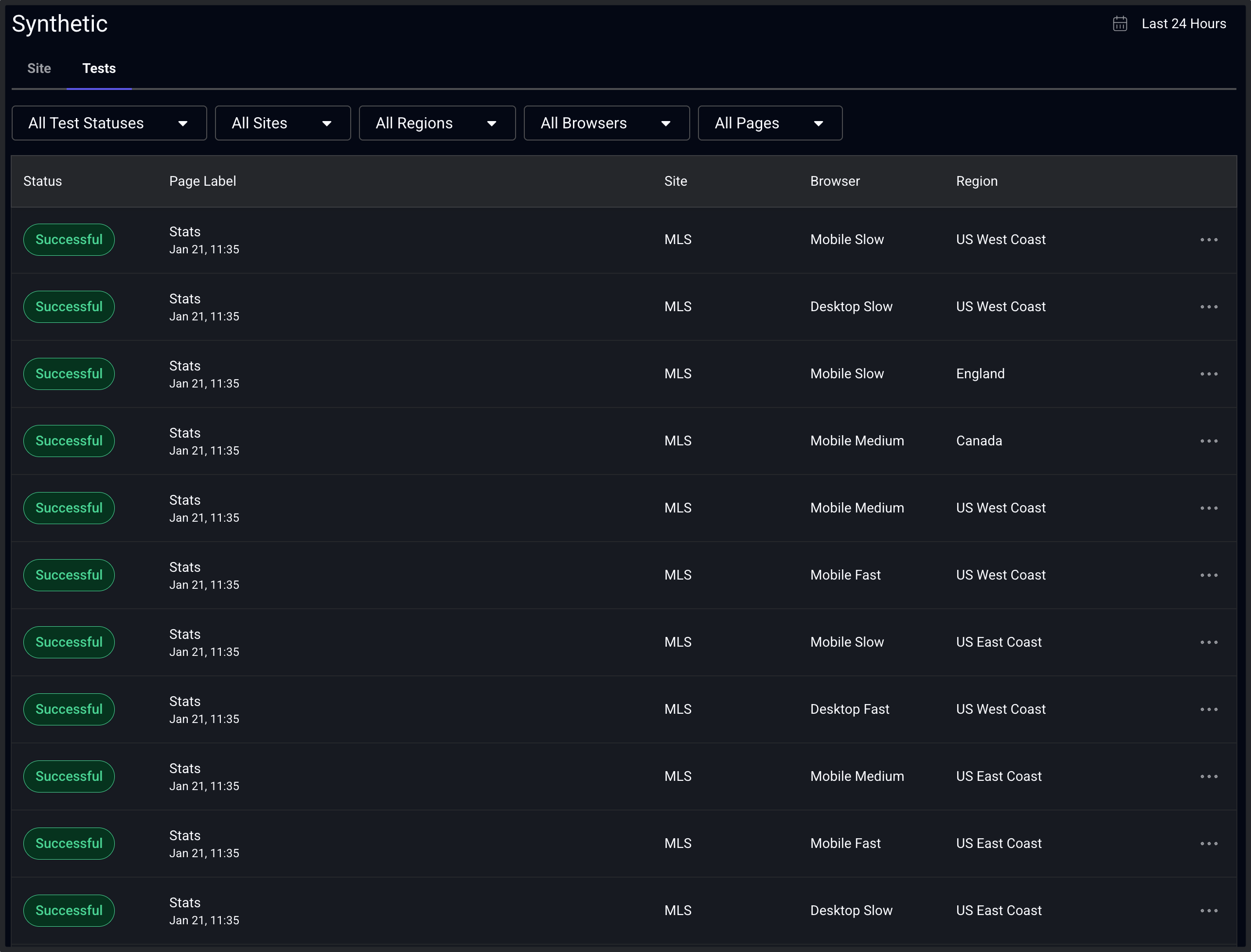
Tests
The Tests dashboard is located in a tab on the overview page. This list view shows individual test executions, starting with the most recent.The list can be filtered by status, site, browser, and geographic region. This view allows teams to quickly inspect specific test runs, starting with the most recent.