Custom Dashboards
Custom Dashboards
In addition to our pre-built dashboards for topics like Crashes, Logs, and Network Requests, each project can create Custom Dashboards. In these dashboards, you can create new analyses. For example, you can visualize a time series of Crash data segmented by app-version, or get a ranking of Logs filtered by a specific property.
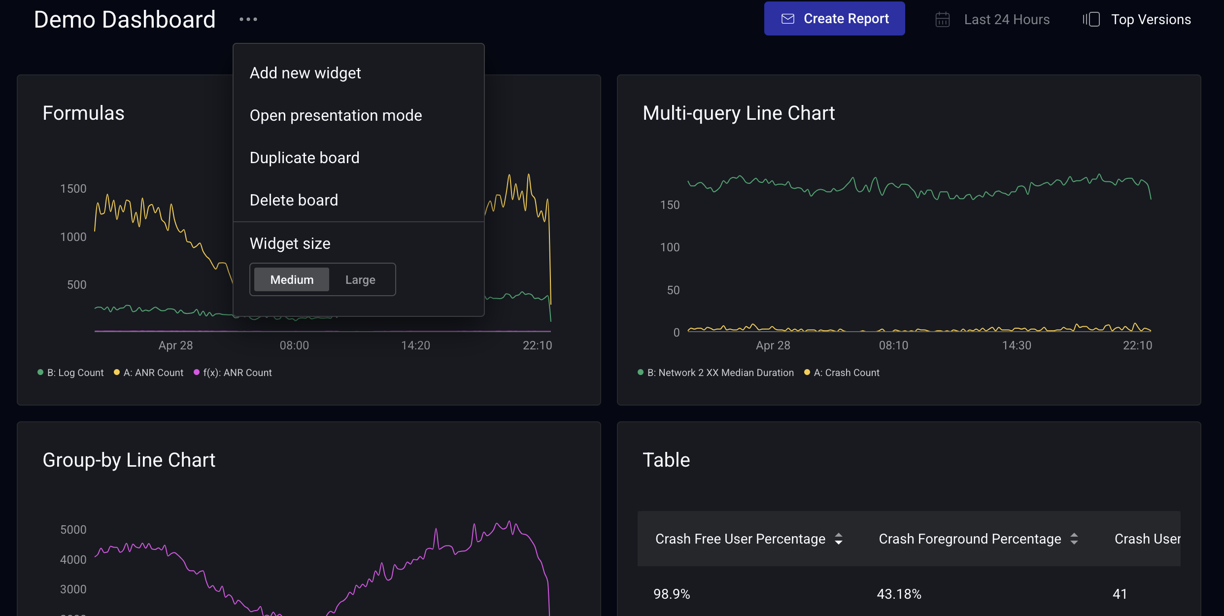
To get started, click on "Add new widget" in the menu by your dashboard name.
Building dashboards and queries
Creating a Chart
You can create multiple types of visualizations. A table of which visualizations are supported is shown below:
| Chart Type | Crashes | Network | Logs | Issues | Moments | Sessions | Spans | Historical | Multi-query |
|---|---|---|---|---|---|---|---|---|---|
| Line | ✅ | ✅ | ✅ | ❌ | ✅ | ✅ | ✅ | ✅ | ✅ |
| Bar | ✅ | ✅ | ✅ | ❌ | ✅ | ✅ | ✅ | ❌ | ✅ |
| Pie | ✅ | ✅ | ✅ | ❌ | ✅ | ✅ | ✅ | ❌ | ✅ |
| KPI | ✅ | ✅ | ✅ | ❌ | ✅ | ✅ | ✅ | ❌ | ✅ |
| Gauge | ✅ | ✅ | ✅ | ❌ | ✅ | ✅ | ✅ | ❌ | ✅ |
| Table | ✅ | ✅ | ✅ | ✅ | ✅ | ✅ | ✅ | ❌ | ❌ |
Combining Multiple Queries
Custom Dashboard widgets support combining multiple queries in a single visualization for Line, Bar, Pie, KPI, and Gauge widgets. You can add up to 10 queries to a widget and, optionally, combine them with a formula using arithmetic operators.
NOTE: as of 2025-05-20, the chart builder has been improved. Any legacy charts using fills have been moved to multi-query line charts. Multi-query support was extended from Line charts to Bar, Pie, KPI, and Gauge widgets in 2026-04.
How multiple queries render per visualization
How multiple queries are displayed depends on the visualization type:
- Line: each query renders as its own series on a shared time axis. Up to 10 series can be visible at once.
- Bar: each additional query adds bars at the same X-axis points; group-bys add bars too, and stack with queries when stacked mode is enabled.
- Pie: queries contribute slices to a single pie chart. Only one query or formula can be visible at a time. Use the eye icon on the right of each query to choose which one is graphed.
- KPI: each query produces a single number. Only one query or formula can be visible at a time to avoid showing more than one number in a widget. Use the eye icon on the right of each query to switch between queries; per-query thresholds are preserved.
- Gauge: same as KPI. One query or formula visible at a time, switched via the eye icon.
For Pie, KPI, and Gauge widgets, the full list of configured queries appears in both the form preview and the rendered dashboard, so viewers can see every query the widget defines even though only one is displayed.
Limitations and constraints
- Single-value visualizations are exclusive: Pie, KPI, and Gauge widgets only ever display one query or formula at a time. The other queries are configured but hidden behind the eye-icon toggle.
- Pie chart shared group-by: all queries (and the formula, if present) on a Pie widget must share the same group-by. Mismatched group-bys are rejected with a validation message at edit time.
- Bar chart shared X-axis: all queries must share the same x-axis dimension.
Adding formulas to widgets
You can combine queries arithmetically by adding a formula. The formula field is collapsed by default. You can click + Add formula next to the query rows to reveal it.
For example, you want to get a rate over the last 24 hours of the sum of crashes and ANR's with a duration of 3.5 to 10 second relative to your total sessions, grouped by App Version. To do this:
-
For the initial query A, select Crashes as the source, Crash Count as the metric, and App Version in the group by field.
a. You can also add a group by here. For this example, we group by App Version. See more on grouping functionality below. -
On query A, click the Filter By button below the query details and filter for State = foreground.
-
Create a second query (B) by clicking the "Add query" button. Select ANR's as the source, ANR count as the metric, and again group by App Version.
a. On query B, filter for Duration Bucket (milliseconds) = 3500 - 10000. -
Create a third query (C) for your Session Count grouped by App Version and filter for foreground sessions using the same process as in query A.
-
Hide queries A, B, and C by clicking the eye symbols at the right side of each query row.
-
Click + Add formula, then enter
(A+B) / Cin the formula input. You can optionally multiply this by 100 to get a y-axis as a percentage (((A+B) / C) * 100).
a. The Formula field accepts the operators:+, -, *, /.
b. Order of operations follows standard PEMDAS.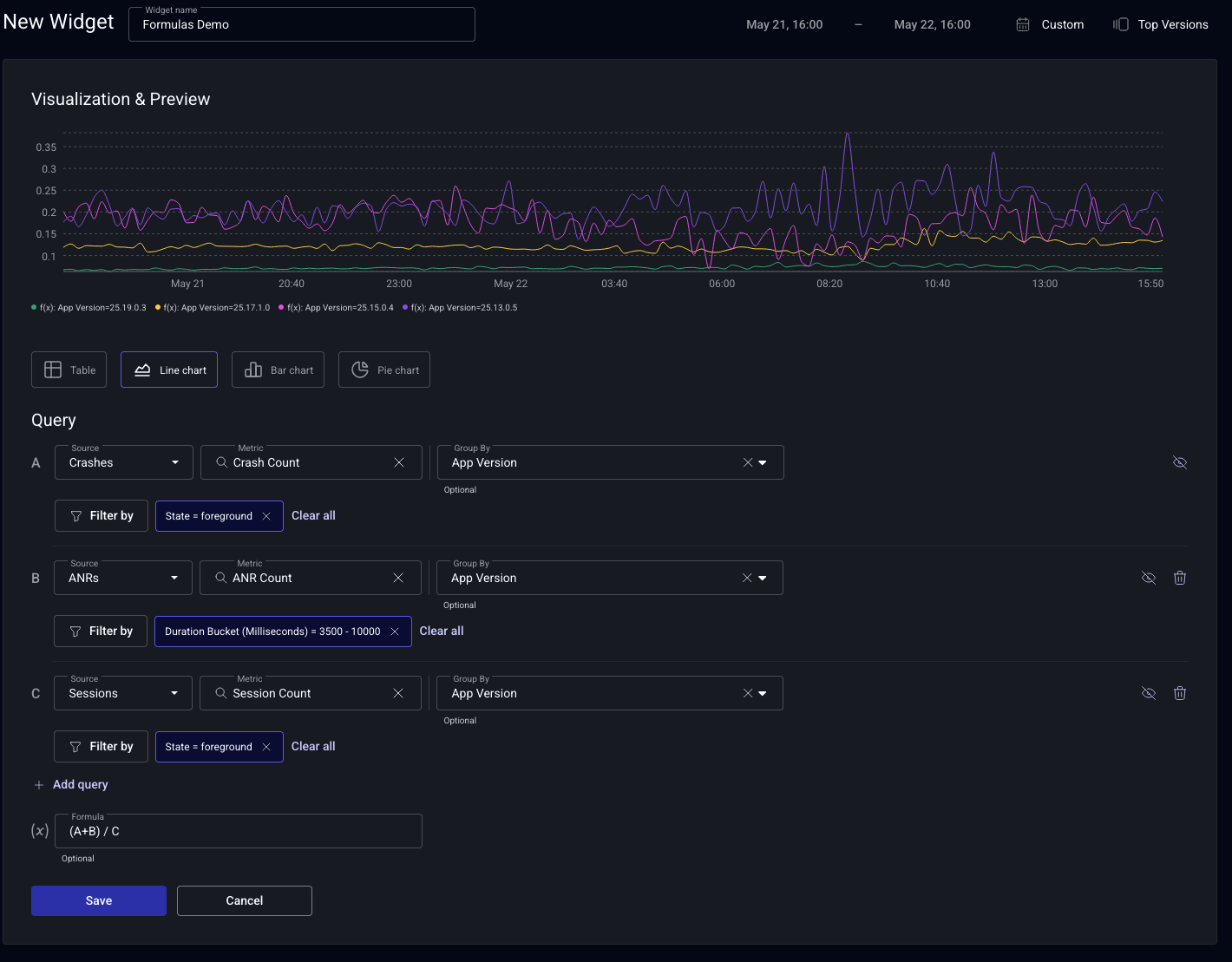
How the formula's result is rendered depends on the visualization. On Line and Bar widgets it appears alongside the source queries (a new line, or new bars at each x-axis point). On Pie, KPI, and Gauge widgets, the formula behaves like another query under the single-visible-query constraint. Toggle it on with the eye icon to display its result instead of one of the source queries.
Showing multiple queries without a formula
The formula field is optional. On Line and Bar widgets, you can leave it blank and visualize up to 10 queries on the same widget, using the eye icons to show or hide individual queries. On Pie, KPI, and Gauge widgets, only one query can be visible at a time even without a formula — the eye icon switches which configured query is graphed.
Grouping rules for combined queries
When you combine queries that have groupings defined with a formula, it's important to understand the rules for how queries are joined given their groupings. The examples below use two queries, but the same rules apply with any greater number of queries.
As a rule, if you have two queries that both have groupings, the grouping of one query must be a subset of the other. The common subset is the join key. Otherwise the combination is invalid.
Valid Groupings:
- Grouping only on one query
A: grouped by[”App Version”]- Returns values for each distinct, non-empty
App Version.
- Returns values for each distinct, non-empty
B: grouped by[]- Returns 10
Ahas a grouping andBdoes not. Their common join key is the empty set.
| Dimension | A | B | A + B |
|---|---|---|---|
{"App Version": "1.0"} | 100 | 10 | 110 |
{"App Version": "2.0"} | 50 | 10 | 60 |
- Grouping on both queries
A: grouped by[”App Version”, “Country”]- Returns values for each distinct, non-empty combination of grouping dimensions.
B: grouped by[”App Version”]- Returns values for each distinct, non-empty
App Version.
- Returns values for each distinct, non-empty
- Both
AandBhave groupings, andBis a subset ofA. Their common subset is[”App Version”].
| Dimension | A | B | A + B |
|---|---|---|---|
{"App Version": "1.0", "Country": "US"} | 100 | 10 | 110 |
{"App Version": "1.0", "Country": "MEX"} | 30 | 10 | 40 |
{"App Version": "2.0", "Country": "US"} | 50 | 20 | 70 |
{"App Version": "2.0", "Country": "MEX"} | 60 | 20 | 80 |
- No groupings
A: grouped by[]B: grouped by[]AandBhave no groupings. Their common join key is the empty set.
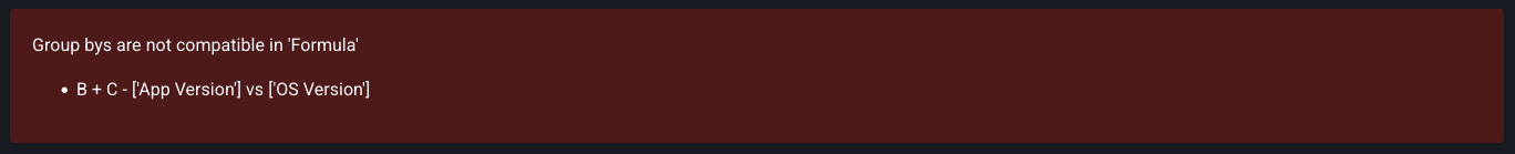
Invalid Groupings:
-
Grouping with no overlapping set
A: grouped by[”App Version”]B: grouped by[”OS Version”]- Both have groupings but neither is a subset of the other.
-
Grouping with similar Attributes, but no overlapping data
A: grouped by[”App Version”, “Country”, “OS Version”]B: grouped by[”App Version”, “Country”, “Model”]- If A and B have no similar
App VersionandCountry, the grouping is valid, but neither is a subset of the other and no results are returned.
Order of Operations
Additionally, order of operations matters. Consider a situation where you create three queries:
Agrouped by["App Version", "OS Version"]Bgrouped by["App Version"]Cgrouped by["OS Version"]
Then you were to combine them in the formula field:
- Valid:
(A + B) + C:AandBshare a grouping dimension and can combine, then combine withC. - Invalid:
A + (B + C):BandCdo not share a group-by dimension and therefore fail.
Function mode
Function mode lets you build any metric from scratch instead of picking a fixed, pre-built metric. Both query styles are available: you can keep using the classic pre-built metrics, or switch to function mode.
How function mode works
You compose a query from three building blocks—a source, a function, and a measure—then narrow it with filters and group-bys. Rates and other composite metrics are built by combining multiple queries with a formula.
Every function applies to a measure, which is a field on the source. count(measure) and count_distinct(measure) work on any measure: count includes every record, while count_distinct counts each unique value once. The numeric-aggregation functions (sum(measure), avg(measure), percentile(measure, p), max(measure), and min(measure)) require a numeric measure, such as a duration or a custom numeric attribute.
Supported functions
Function mode supports the following functions:
count(measure)—the total number of records for a measure, counting every value including repeats.count_distinct(measure)—the number of unique values of a measure, such as unique users or unique devices.sum(measure)—the total of a numeric measure.avg(measure)—the average of a numeric measure.percentile(measure, p)—the value at percentilep, wherepis a decimal between 0 and 1. For example,percentile(span.duration, 0.95)is the p95 duration.max(measure)—the largest value of a numeric measure.min(measure)—the smallest value of a numeric measure.
To build a rate or any other composite metric, combine multiple queries with a formula. See Combining multiple queries. For example, a rate follows the pattern (A / B) * 100.
NOTE: the median is not supported directly. Use percentile(measure, 0.5) instead.
Building a query
- Choose a source—for example Sessions, Crashes, ANRs, Spans, Logs, Network Requests, or Web Vitals.
- Choose a function—for example
count,avg, orpercentile. - Choose the measure the function applies to, such as a duration or a custom numeric attribute.
- Optionally add Filter by conditions to narrow the records included.
- Optionally add Group by dimensions to break the result out into series or rows.
Examples
You can rebuild any of Embrace's pre-built metrics in function mode. Each example below compares the classic pre-built metric (old mode) with the same query in function mode (new mode).
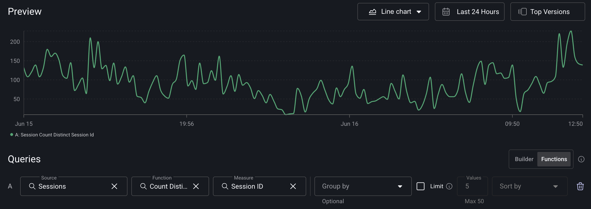
Session count (single query): in function mode, use count_distinct(session_id) on Sessions. This is equivalent to the classic Session Count metric.
Old mode:
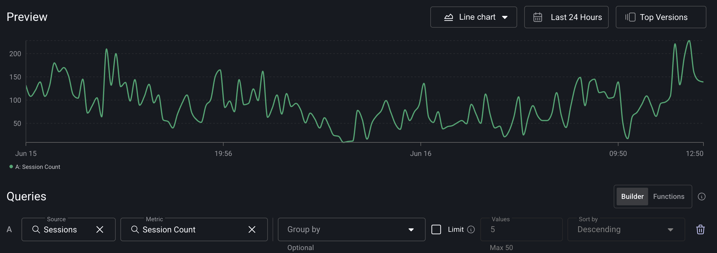
Function mode:
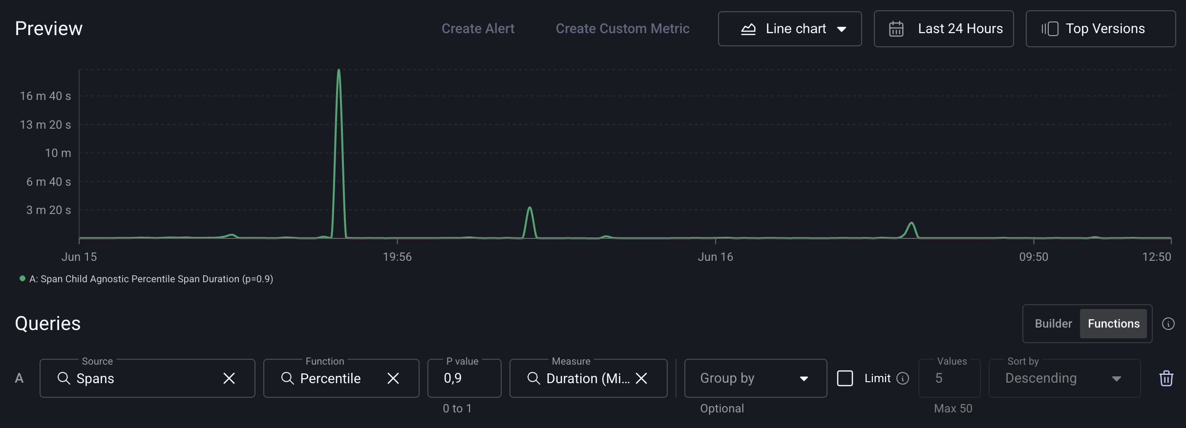
Span 90th percentile duration (single query): in function mode, use percentile(span.duration, 0.9) on Spans. This is equivalent to the classic Span 90th Percentile Duration metric.
Old mode:
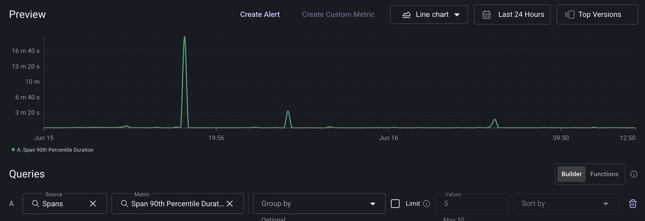
Function mode:
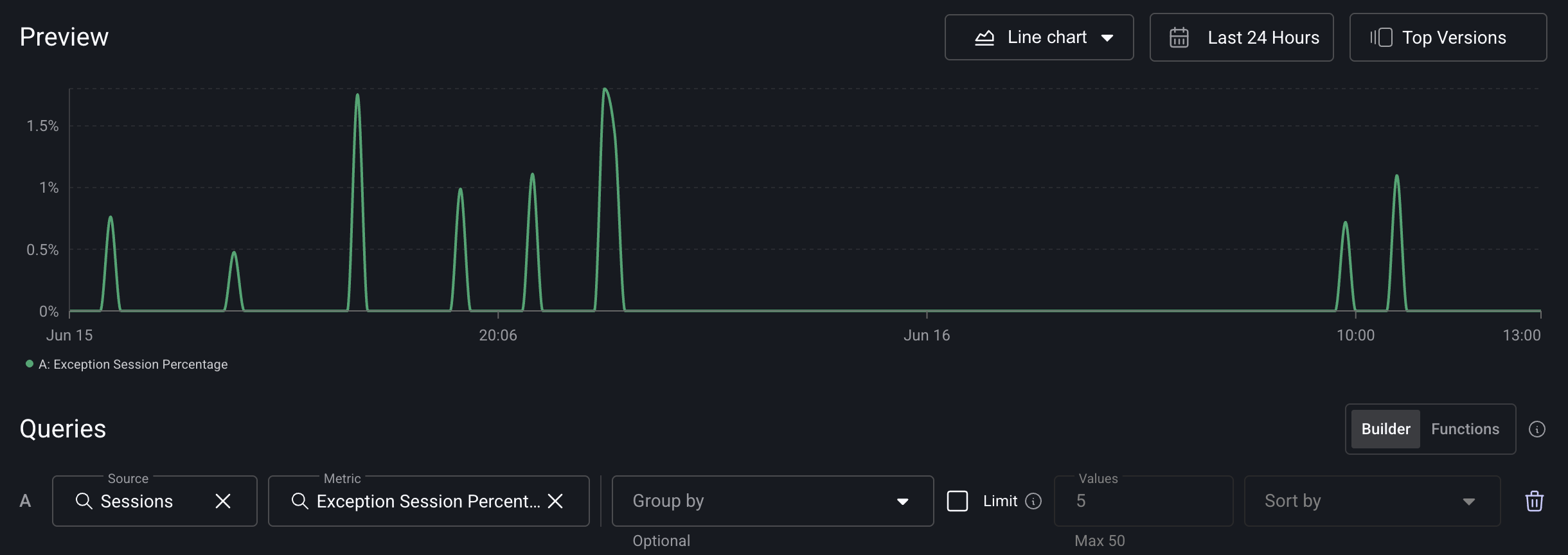
Exception session percentage (two queries + formula): in function mode, query A is count_distinct(session_id) on Sessions, query B is count_distinct(session_id) on Sessions filtered by Has Exception = true, with the formula B / A * 100. This is equivalent to the classic Exception Session Percentage metric.
Old mode:
Function mode:
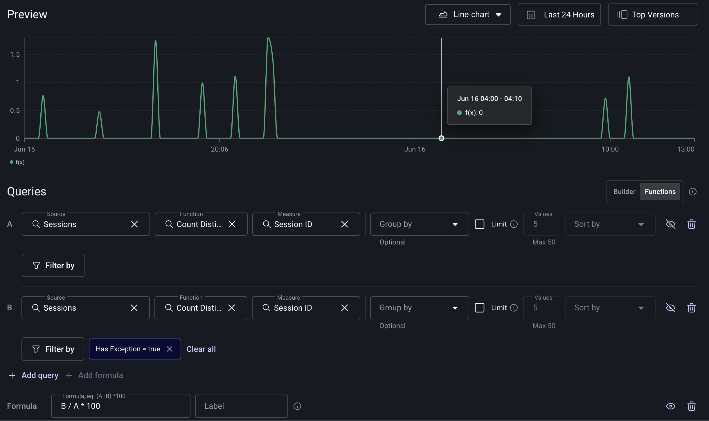
For the mechanics of combining queries and writing formulas, see Combining multiple queries.
Grouping by Exploded Properties
You can group your widgets by exploded properties—these are properties that can contain multiple values which we automatically "explode" so each value can be analyzed individually.
This is especially useful if you’re tagging Sessions, Logs, Spans or other events with multiple values and want to break them out into individual groups.
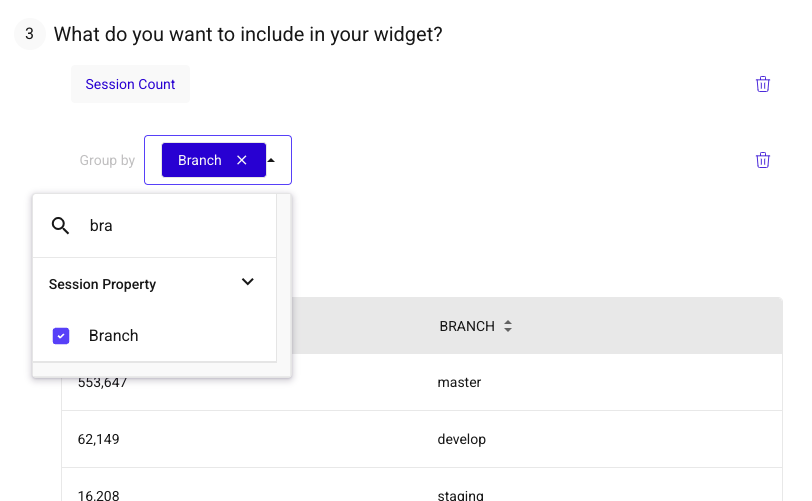
For example, if a Session has a property like BRANCH=["master", "develop", "main", "staging"], you can group by BRANCH, and each of those values will be treated as its own group.
To group by an exploded property:
-
When adding or editing a Widget, go to the Group By section.
-
Start typing the name of the property you want to use—exploded properties will appear just like any other attribute.
-
Select the property. If it's a multi-value field, we'll automatically explode it for you.
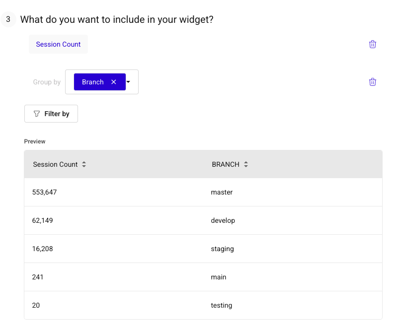
In your results, each unique value will show as its own row or series—allowing you to analyze each individual value separately.
Managing and sharing dashboards
Copying widgets to other dashboards
You can reuse a widget you've already built by copying it to one or more other dashboards in the same app. You can copy to existing dashboards or create a new one in the process.
- On the dashboard that has the widgets you want to copy, click the three dots icon on a widget to open its action menu, then choose Copy to dashboard.
- The dashboard enters multi-select mode. Use the checkbox on each widget tile to select every widget you want to copy.
- Click the Copy to dashboard button in the top right of the screen.
- In the modal that appears, choose one or more existing dashboards from the list, or click Create New Dashboard to copy the widgets into a new one.
- After you confirm, you can navigate to the destination dashboard or stay on the current page to keep editing.
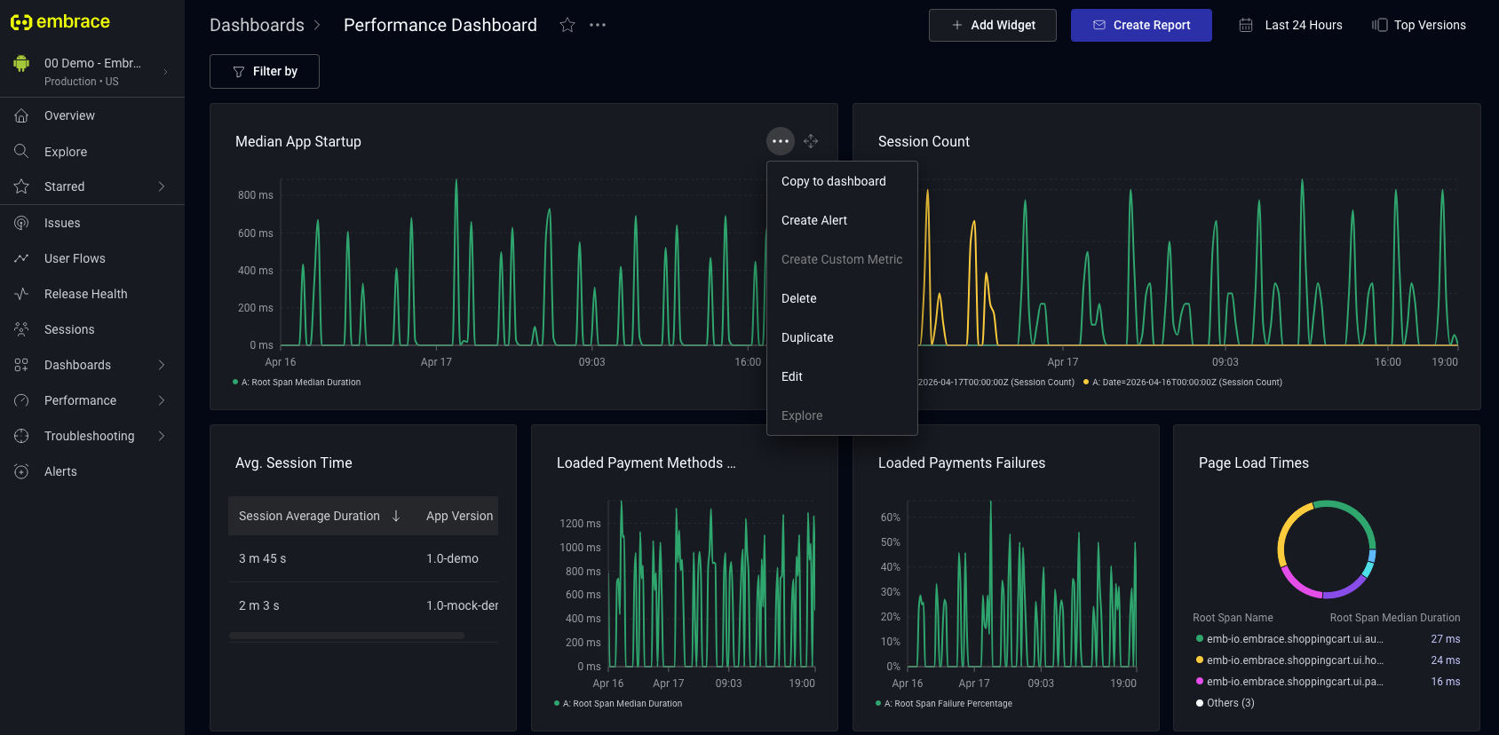
Copied widgets are fully independent. They contain no back-reference to the source dashboard or original widget, so edits to a copy do not affect the original or any other dashboard.
Copying dashboards across apps
If you manage multiple apps in Embrace, you can copy a dashboard from one app to another instead of rebuilding it. This is useful for teams that want to maintain a consistent monitoring setup across apps.
You can start the copy from two places:
- From the All Dashboards page: click the three dots next to any dashboard in the list, then select Copy to app.
- From an individual dashboard: click the three dots in the menu next to the dashboard name, then select Copy to app.
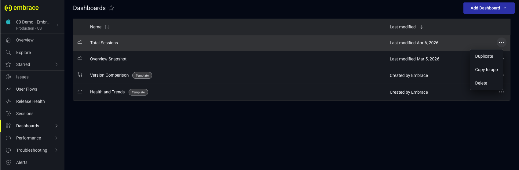
In the Copy dashboard to app modal, select one or more apps in your organization to copy the dashboard to. All copy actions respect app-level access permissions, so only apps you have access to appear in the list. Once you confirm, you can open the new dashboard in the destination app or stay on the current page.
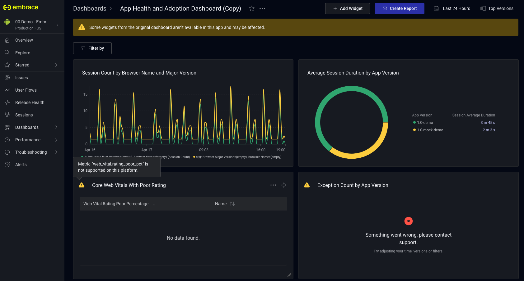
Error states in copied dashboards
A widget copied across apps may not render correctly if something it depends on, such as a filter key, metric, or dimension, is not available in the destination app. When this happens, the dashboard shows an inline warning, and affected widgets display an error indicator. Hover over the indicator to see a tooltip that explains the specific cause so you can adjust the widget.
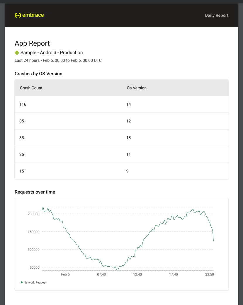
Emailing Custom Dashboards
You can also email your Custom Dashboards to yourself or your team.
Click on the "Create Report" button in the top right of your dashboard.
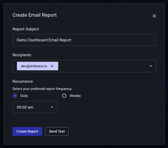
You can set a title for your report, add the recipients, and set the frequency of the report. Frequency options include daily and weekly. You can also set the time of day you'd like to receive the report. You can update any of these options after the report is created.
Before sending the report, you can send a test email to the recipients to ensure the report looks as expected. After a few minutes you should receive the test email.
Specialized custom dashboards
Spans (Traces)
Create graphs monitoring Spans performance. You can filter and group by name, outcome, duration, and any custom Attributes you have set on the Span.
- First, select the visualization type you want to see and a source for the query.
- Then, choose the metric you wish to aggregate. For Spans, Embrace supports both counts and sums of duration.
- Finally, add any filters and group-bys. In addition to our core dimensions, for Spans you can use the Span's name, outcome, duration, and any custom Attributes.
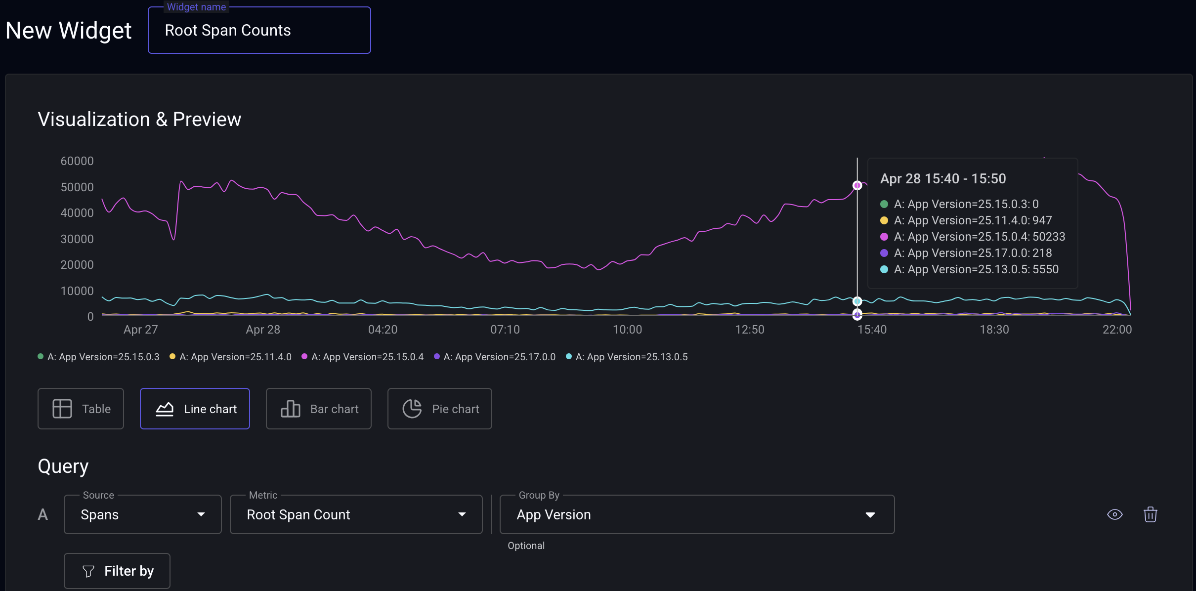
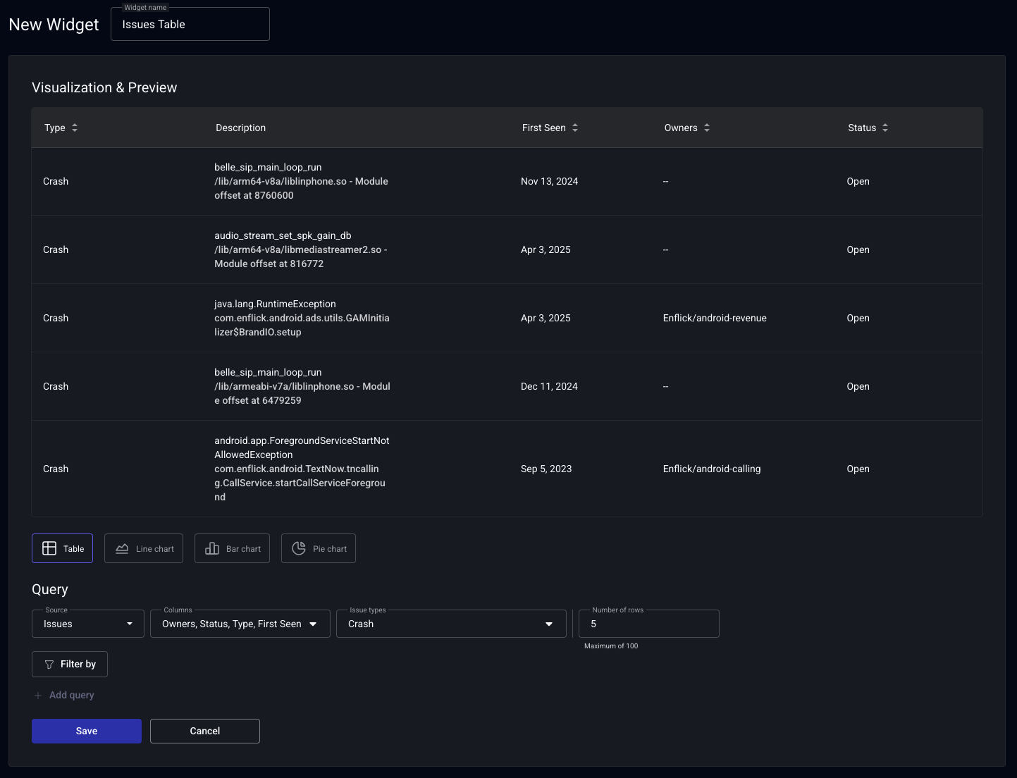
Table of Issues
Our Issues Widget, lets you specify how to list a table of Issues . You can filter for certain Issue types, add filters to limit app-versions, or select just Issues tagged to your team.
-
To get started, select the Table visualization option and Issues as the source when making a new Widget.
-
Adjust the columns you want to display and how to filter the Issues.
-
Then, once you save, you'll see this table on your dashboard! Issues are sorted by percentage of users impacted in descending order.