Web Vitals
Embrace collects and captures Web Vitals and other key metrics for each page of your web application. These metrics provide insight into key aspects of your site performance.
Web Vitals are defined by Google to measure user experience in production and can impact how a site is ranked in search results.
The metrics collected are:
- Time to First Byte (TTFB), which measures how long the browser waited for the server to respond to the request for HTML page content.
- First Contentful Paint (FCP), which measures when the page first starts to display content to the visitor.
- Largest Contentful Paint (LCP), which measures when the largest image or text content is displayed to the visitor.
- Interaction to Next Paint (INP), which measures how quickly a page responds to user interactions (click, tap, keypress).
- Cumulative Layout Shift (CLS), which measures how much content moves around the screen as the page loads, or the visitor scrolls.
The dashboard allows you to quickly identify which Web Vitals need improving and where in the application they need to be improved.
Using the Web Vitals Dashboard
The Web Vitals dashboard is split into six tabs – an overview tab and one for each of the Vitals.
Each tab has an red / amber / green marker allowing you to quickly see the current rating for each Vital.
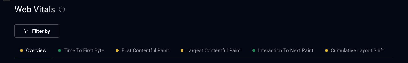
As with other dashboards, it can be filtered to a subset using the filters at the top of the page.
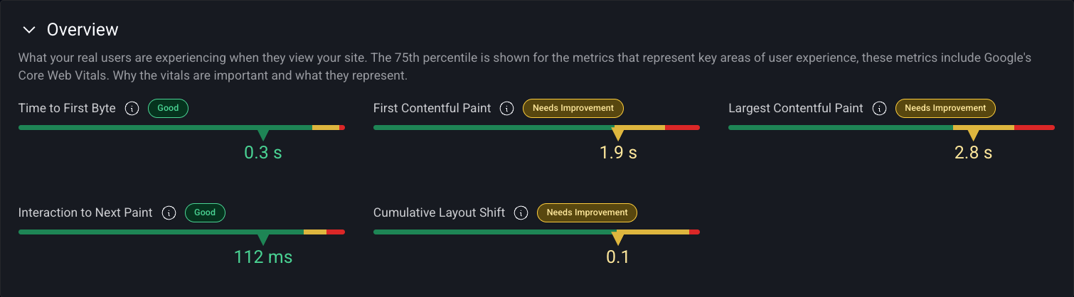
Overview Tab
The top panel contains a distribution chart for each Vital showing the proportion Good, Needs Improvement and Poor measurements along with the 75th percentile value for the Vital.
The table allows you to understand how the Vitals vary across the different areas of your application and highlights areas where they need improving.
By default the table is grouped by Page Label and the percentage column shows the relative number of data samples.
The other columns show the 75th percentile value for relevant Vital and the color indicates whether the Vital is rated Good, Needs Improvement or Poor.
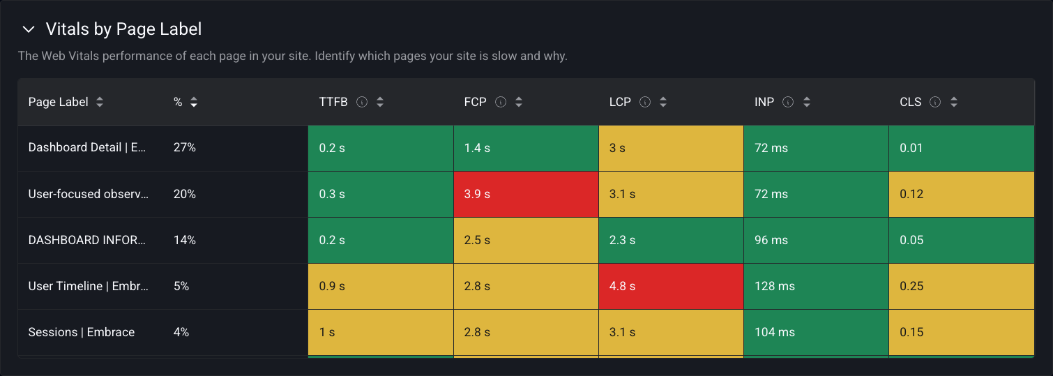
Hovering over a table cell reveals a tooltip. See Details will switch to the relevant Vitals tab and filter by the chosen Page Label.
Other tables in the overview tab show how performance varies by Device Type, Browser and Location.
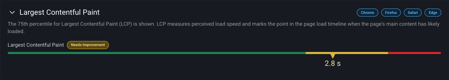
Individual Vitals Tabs
Each of the Vitals tabs follows a similar pattern and the examples below are taken from the LCP tab.
The top panel shows the distribution chart for LCP split by the proportion of Good, Needs Improvement and Poor measurements along with the 75th percentile value for LCP.
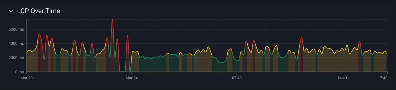
The timeseries chart illustrates how the 75th percentile varies by time. Seasonality is common in timeseries data and metrics can vary between day and night or between weekdays and weekends depending on the visitor mix. The chart line is colored by the corresponding Vital rating for the time interval.
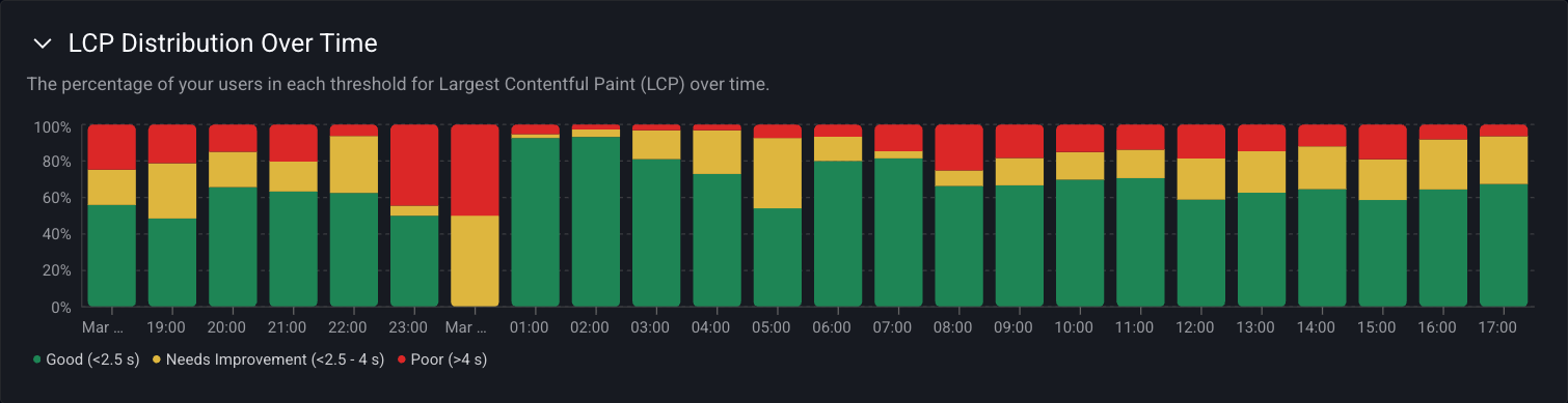
The stacked column chart shows how the split of Good, Needs Improvement and Poor ratings vary over time.
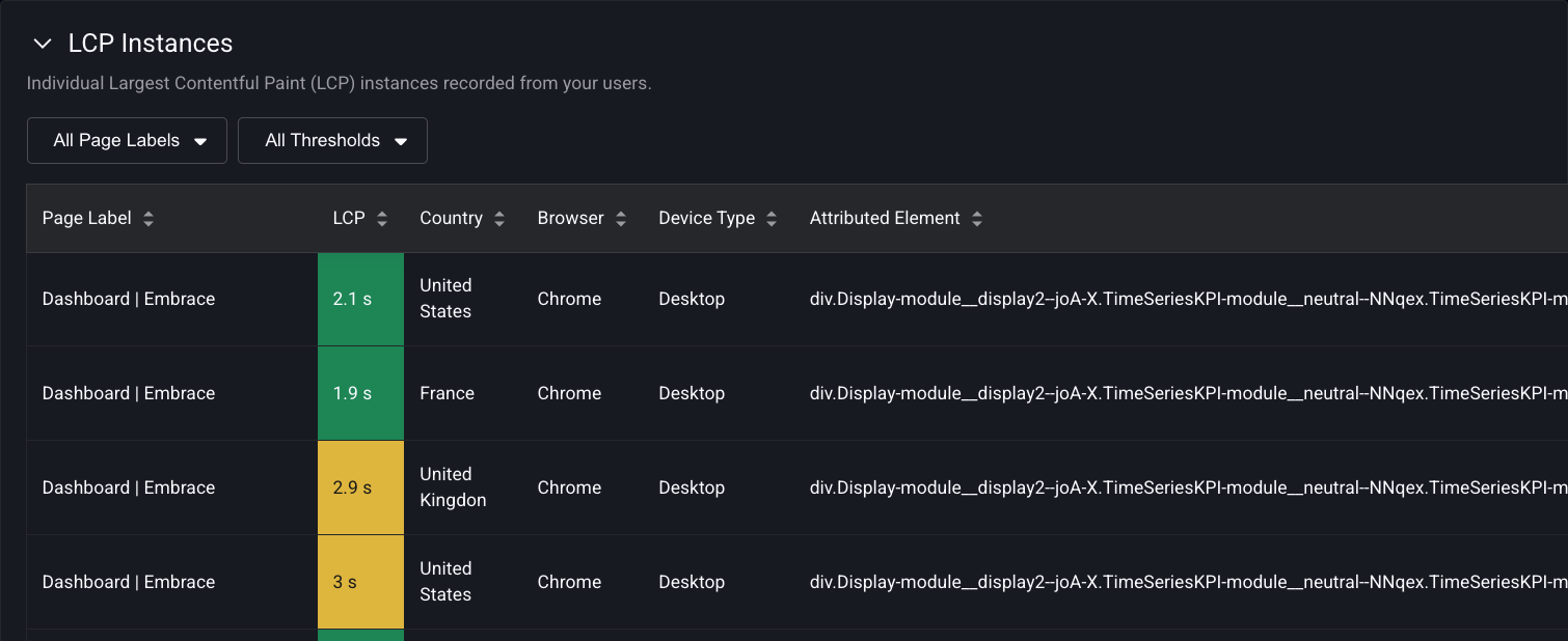
At the bottom of the dashboard is a table showing examples of LCP measurements. Clicking on a row takes you to the User Timeline for the chosen example.
Web Vitals are available in context with the other technical operations of a user's session in the User Timeline. For a given Core Web Vital, Embrace displays the element that is most responsible for creating the Core Web Vital calculation.
Web Vitals for pages can also be aggregated and analyzed across all users with Custom Dashboards.
Implementation
Web Vitals are automatically collected by the Embrace Web SDK.