WEBINAR: Coming soon to a browser near you: OpenTelemetry! Experts share how the OTel community is building better browser observability.

Register here

Unlock deeper insights with revamped Custom Dashboards

At Embrace, we’re always striving to empower you with the clearest, most actionable data to understand your app’s performance. That’s why we’re excited to announce some significant improvements to our Custom Dashboards capabilities, bringing you a streamlined, more powerful, and intuitive experience for visualizing your telemetry data. 

Let’s dive into what’s new:
A seamless chart building experience

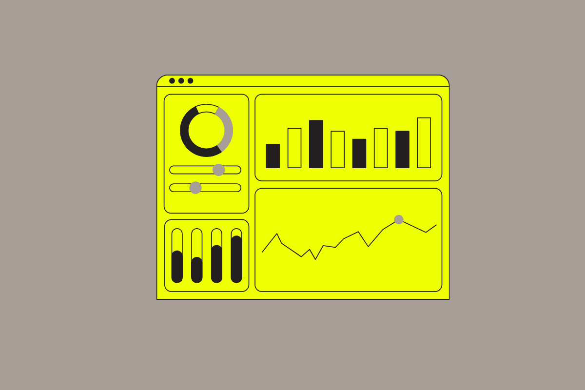
We’ve completely redesigned the chart building process. What was once a multi-step process has been transformed into a single-page, all-in-one builder experience. This unified approach means you can create and customize your charts without ever leaving the page, making the process smoother and more efficient.

Dynamic multi-querying for complex relationships

Understanding the intricate relationships between different types of telemetry is now simpler than ever. Our new chart builder functionality allows you to run multiple queries to feed a single chart or widget. The data from these queries can be used in arithmetic operations to uncover custom, complex relationships that matter most to your team.

Enhanced searchability for quick access

Finding the right metrics to build your chart is now easier. Once you select a data source, Embrace’s chart builder automatically filters the metrics available to you based on that telemetry type. For example, if you’re building a chart based on networking telemetry, only relevant network metrics will appear in the drop-down menu. Plus, all labels in drop-down selectors are now searchable, helping you efficiently find exactly what you need.

Exploded properties grouping to break out unique values

For those critical properties that contain multiple values, our new exploded properties grouping is a game-changer. We automatically break out all of the individual values of these properties, allowing them to be analyzed separately. This is incredibly useful for tags like BRANCH=[“master”, “develop”, “main”, “staging”] where you can now group by BRANCH and treat each value as its own distinct group, providing granular insights into your data.

New chart visualization options for richer storytelling

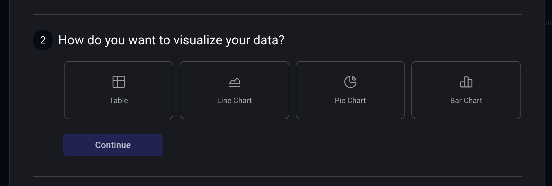
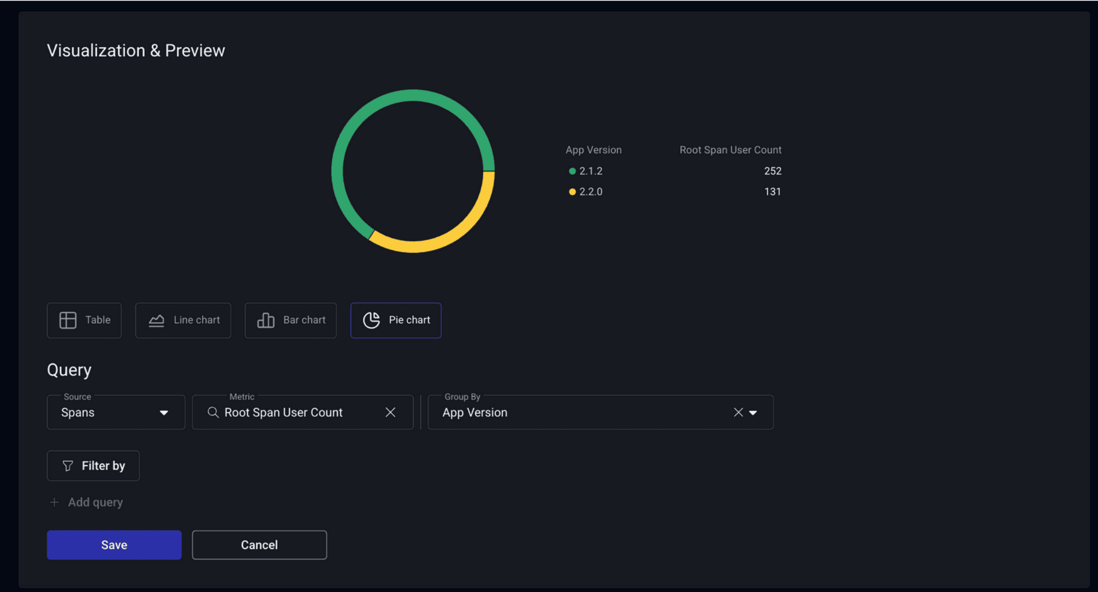
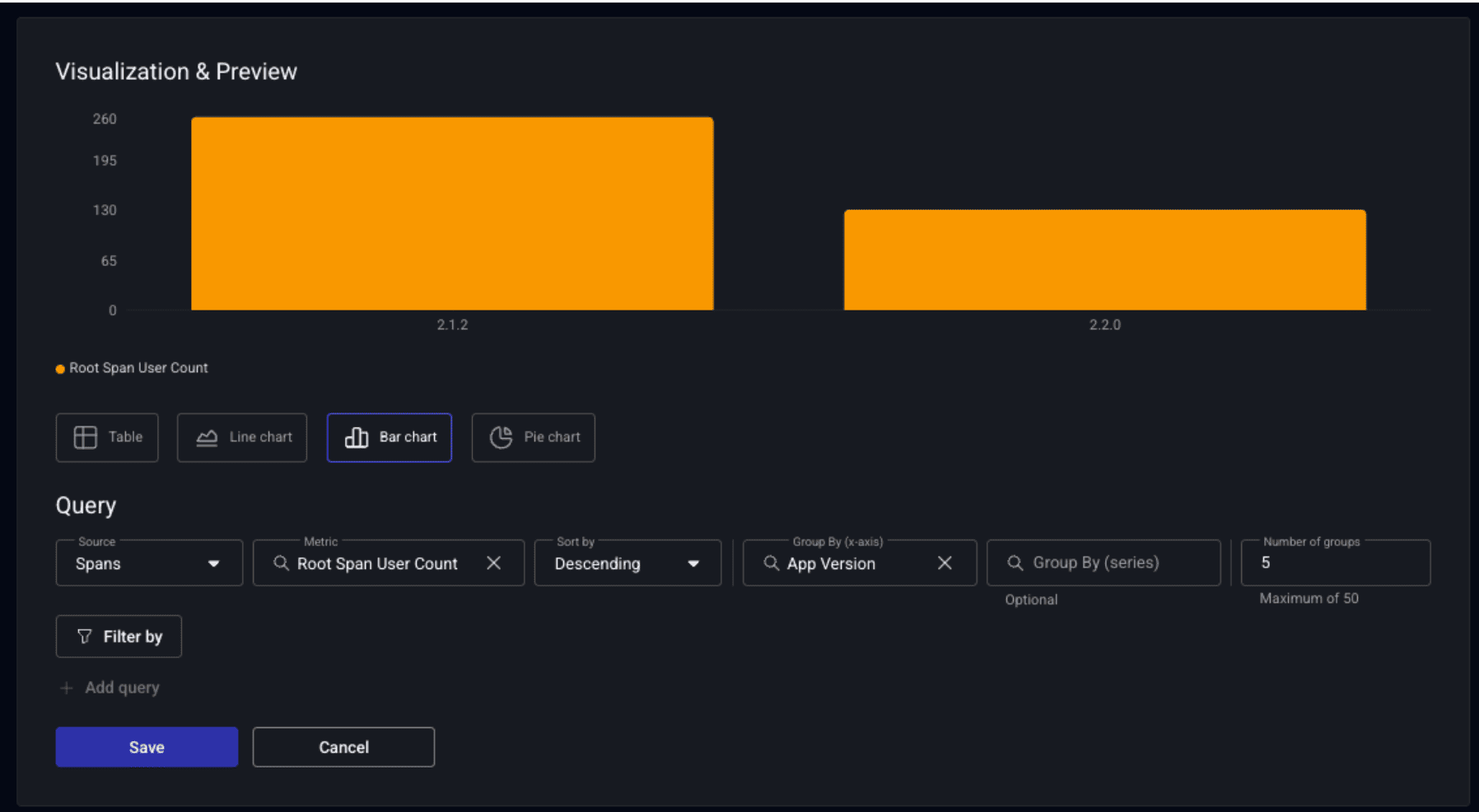
Your data deserves the best representation. In addition to our existing tables and line charts, we’re excited to introduce new visualization options: pie charts and bar charts. This expanded flexibility means you can now choose the chart type that most effectively represents the type of query you’re analyzing or tracking.

New table of issues view

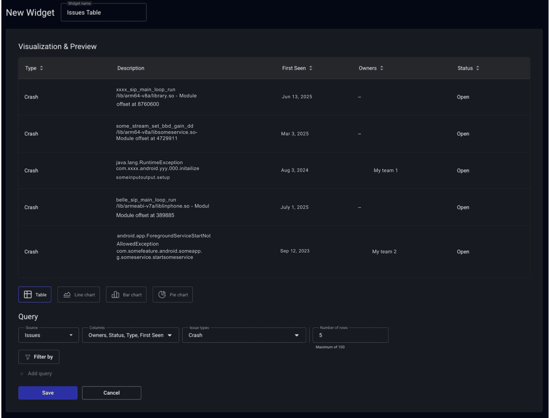
Stay on top of critical issues with our new issues view widget. This feature lets you specify and visualize a list of specific issues directly on your dashboard in a table format. You can filter for various issue types, such as crashes or ANRs, or overlay additional filters to focus on specific app versions. You even have the power to select only the issues tagged to your team. This table appears alongside your other custom charts, with issues sorted by percentage of users impacted in descending order.

Highlight and zoom for better time range analysis

Gone are the days of manually adjusting time selectors! Now you can simply click and drag across any chart visualization to highlight and zoom into a specific time range. What’s more, only the specific visualization zooms in, preventing unnecessary page reloads. Once you’ve zoomed, you have two flexible options: “Apply to all” to apply that time range across your entire dashboard, or “reset” to jump back to the original time frame once your analysis is complete.

Learn more

These improvements make it easier for engineers to interact with and understand their app’s data in Embrace, gaining deeper and more precise insights with unparalleled ease. 

To learn more about our Custom Dashboards capabilities, check out our docs. If you’re not an Embrace customers, you can get started for free and explore this feature for yourself. 

Embrace Deliver incredible mobile experiences with Embrace.

Get started today with 1 million free user sessions.

Get started free
Related Content
Unleash deeper insights with Embrace’s new Time Series Arithmetic feature
Embrace's Custom Dashboards have become an even more powerful analysis tool with the release of an exciting new feature - Timeseries Arithmetic. This allows devs to build highly customized widgets by combining different datasets using basic arithmetic expressions.
An image of an old fashioned clock with the date and weekday on a yellow background
Historical look-back now available for Embrace Custom Dashboards
Embrace's Custom Dashboards now let customers analyze long-term trends in their app's health and performance with the new historical look-back feature. Explore a time frame for any datapoints captured by the Metrics API, which now powers these dashboards to allow for even greater analysis capabilities.
New filtering on widget dashboards
Embrace the power of new filtering capabilities on widget dashboards, as we explore how this enhanced feature empowers developers to analyze specific data subsets, gain deeper insights, and make informed decisions to optimize their app's performance and user experience with precision.