
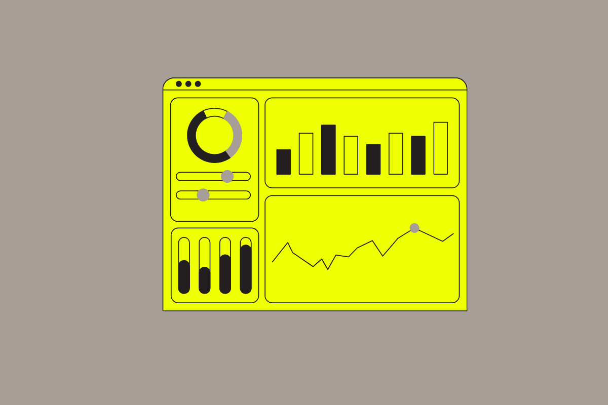
Custom Dashboards
Answering your most complex questions about issues affecting yours users is now faster and easier. KPI, gauge, pie chart, and bar chart widgets now support multiple queries and custom formulas.
Dashboards answer the questions developers already know to ask. The harder wins come from the questions between the numbers: How did our crash rate shift between releases? Which endpoints have the worst failure ratio relative to their traffic? How does P95 compare to P99 on a per-version basis?
While the Embrace platform has provided out-of-the-box experiences for some of those questions, building custom views into the unique instrumentations, attributes and detail of your implementation has always fallen on custom dashboards. To answer those questions you almost always need to combine two or more sets of data, or compare the same data across different filters. Until now, that meant creating several widgets and comparing them by eye, or exporting raw data to do the math elsewhere.
Now, we’ve made multi-query support available across KPI, gauge, pie, and bar widgets. With that, you can:
A + B), ratios (A / B * 100), and deltas (A - B) let users derive and track custom answers on the fly.Comparing a metric across two filtered datasets used to require two widgets and a spreadsheet. Now you can transform that into a single KPI.
Scenario: You shipped v2.2.0 yesterday. Did daily active users go up or down compared to v2.1.0?
Sessions → Daily Active Users, filtered to app_version = 2.2.0Sessions → Daily Active Users, filtered to app_version = 2.1.0A - B, label: “DAU Change”The KPI shows the raw delta. Toggle the eye icon to inspect either version’s DAU in isolation. No single stored metric captures “the difference between two filtered datasets”, and that’s exactly what formulas are for.
")
")
Gauges work best when a single number maps to a target. One thing no stored metric captures directly is a custom multi-step business flow: the sum of the spans you’ve instrumented to track it end-to-end.
Scenario: Your checkout flow is three discrete spans you tagged: cart.load, payment.process, and confirmation.render. None of them tell you the full picture on their own. What you actually care about is total checkout latency at P95. That’s the number a product manager would use to set an SLO.
Spans → Span 95th Percentile Duration, filtered to span_name = cart.loadSpans → Span 95th Percentile Duration, filtered to span_name = payment.processSpans → Span 95th Percentile Duration, filtered to span_name = confirmation.renderA + B + C, label: “Total”Toggle the eye icon to inspect each step in isolation when the total turns yellow: if payment.process is the one running long, you know exactly which team owns the regression.


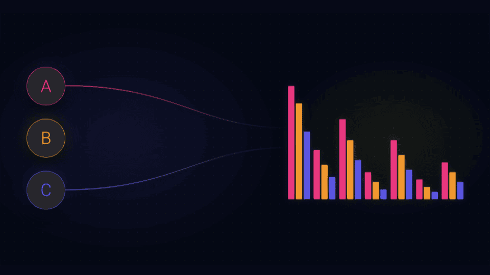
Stored metrics split errors by error code: 4xx is one metric, 5xx is another. But when you’re triaging a rollout, the first question isn’t “what error code is spiking?”. It’s “which release is performing poorly?” A formula view on a pie chart answers that directly.
Scenario: You want to see, at a glance, which app version accounts for the most total failures, regardless of whether they’re client errors, server errors, or some mix of both.
Network → 4xx Call Count grouped by app_versionNetwork → 5xx Call Count grouped by app_versionA + B, label: “Errors”The formula slice view shows one ranked distribution: each slice is an app version, sized by its total failure count across both error classes. Looking at either query alone can mislead. One release might dominate 4xx while another dominates 5xx. The combined view gives you the definitive “which release has the network http request performance” answer, which is exactly what you want open on screen during a rollout.


Bar charts shine by combining both individual measures and grouping in a single chart. Rather than building three separate widgets for P90, P95, and P99, put them on the same chart grouped by app version, which lets you better visually compare improvement or regression across releases. It can also help you get a sense of the delta (talking about long tails again) between your percentile thresholds.
Scenario: You want to track how latency distribution changes across releases, not just the 95th percentile headline number.
Spans → Span Duration P90Spans → Span Duration P95Spans → Span Duration P99app_versionEach release gets three bars side-by-side. A version where P90 is flat but P99 spikes tells a different story than one where everything rises, and the shape is visible at a glance.


Scenario: You care about total failure rate, not just one error class. Combine 4xx and 5xx into a single computed bar per version.
Network → 4xx Error Request PctNetwork → 5xx Error Request PctA + B, label: “Total Error %”app_versionEach version now shows three bars: 4xx, 5xx, and the composite total. A release where the total stays flat but 5xx grows while 4xx shrinks tells you something specific happened server-side.


These visualizations don’t replace the measures Embrace already exposes; they build on top of them. A stored meter answers “what’s my 4xx error rate?”. A multi-query widget answers “how is my 4xx error rate shifting across releases relative to my 5xx rate?”. The former is a data point; the latter gives you eyes on the keys to initiate an investigation.
By bringing multi-query and formulas to KPI, gauge, pie, and bar, the dashboard becomes a place where developers can ask second-order questions without leaving the platform, the same way they already ask first-order ones today.
Multi-query and formula support ships to all users today. If you’re already using line chart formulas, the same mental model now applies everywhere. If you haven’t yet, the best way to start is to find a question you’ve been answering with two widgets and see if it collapses into one.
You can get the full story and details on the Custom Dashboards docs.
Get started today with 1 million free user sessions.
Get started free