WEBINAR: Coming soon to a browser near you: OpenTelemetry! Experts share how the OTel community is building better browser observability.

Register here

Unleash deeper insights with Embrace’s new Time Series Arithmetic feature

We’re excited to introduce a powerful new addition to Embrace’s custom dashboards that will make analyzing and visualizing your mobile data exponentially more powerful: Time Series Arithmetic.

This new feature lets you combine multiple time series data sets within a single chart and perform arbitrary arithmetic operations, unlocking a new level of insight at a glance.

Have you ever wanted to monitor the rate of crashes compared to the rate of ANRs? Or perhaps track the combined number of a few different traces taking longer than three seconds?

With our new time series arithmetic capability, you can now effortlessly create these calculations and visualize them directly in your dashboard view as easily interpretable graphs. 

This new feature now allows you to: 

View multiple time series in a single chart: no more juggling between separate visualizations to compare related metrics. With this new feature, you can look at different time series data in one single view for much easier analysis and trend spotting. 

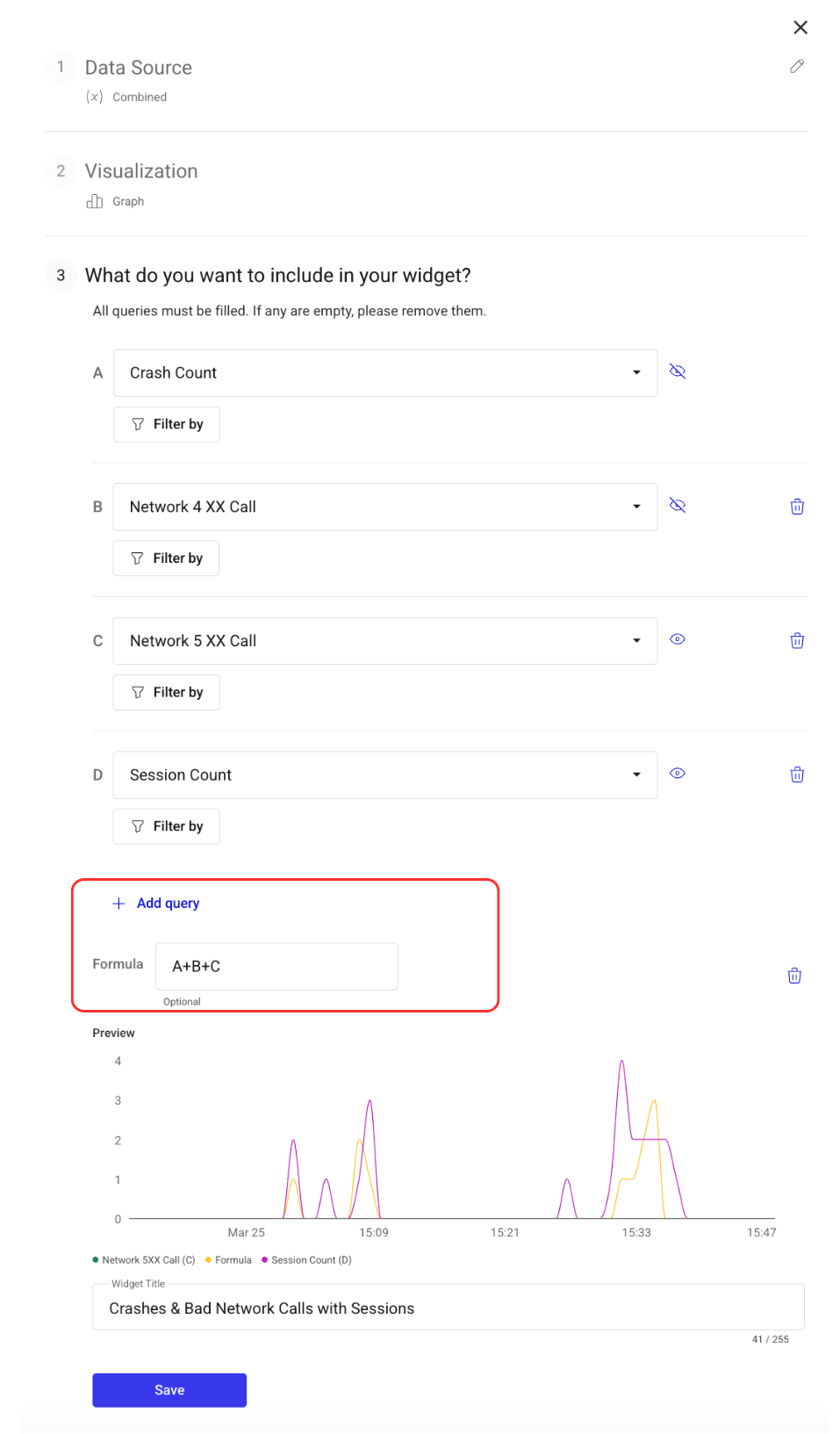
Perform arithmetic operations directly on your time series data: write your own arithmetic expressions using different data sets to create totally customized aggregates and ratios. Supported operations include addition (+), subtraction (-), multiplication (*), division (/), exponentiation (**), and percentage calculation (%). This opens up endless possibilities for building custom formulae for new metrics, ratios, and trends, giving you access to faster and easier analysis.

As an example, you may want to create a custom crash ratio that takes into account both ANR and non-ANR exits. You could do so by combining the two individual time series data sets into one new graph, using the following formula: (Crashes + ANR Session Count) / Sessions.

Improved feedback on query error: creating your own arithmetic expressions can get tricky depending on the compatibility of the datasets you’re using together. So we’ve enhanced our error checks and messaging to help you quickly spot and resolve any issues with your queries. 

Timeseries Arithmetic in action

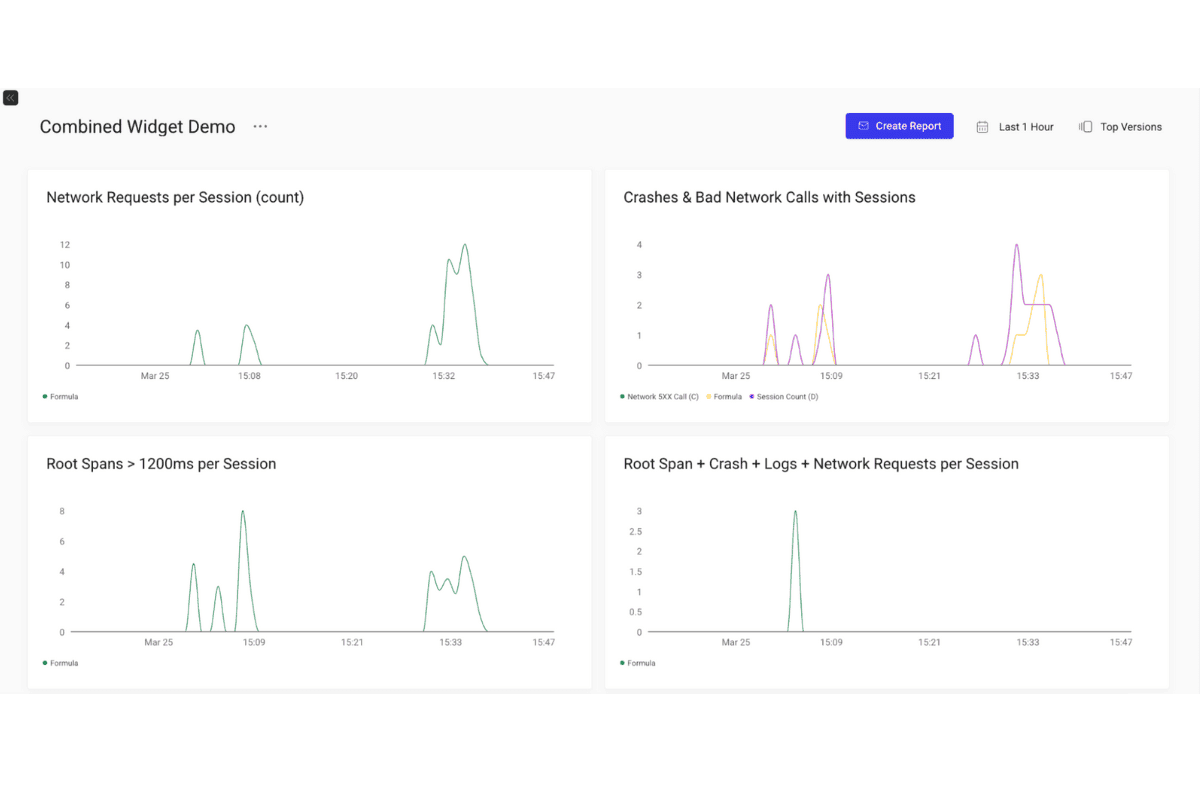
Check out the screenshots below to see what Timeseries Arithmetic looks like in the Embrace dashboard. 

An Embrace dashboard view showing various widgets, including those built with Timeseries Arithmetic
Building a Custom Dashboard Widget in Embrace with a Timeseries Arithmetic operation

More to come

Check back as we continue to roll out more functionality for this exciting new feature. As part of our phase two plans for Timeseries Arithmetic, we’re building out arbitrary grouping capabilities, variable abstraction, and pre-built functions to make more advanced analysis even easier and quicker.   

If you’d like to get started building your own charts and widgets with Timeseries Arithmetic, just head over to the Custom Dashboards section of your Embrace instance. If you’re not currently an Embrace customer, you can get started for free here

Embrace Deliver incredible mobile experiences with Embrace.

Get started today with 1 million free user sessions.

Get started free
Related Content
Unlock deeper insights with revamped Custom Dashboards
Custom Dashboards have always given engineers the flexibility they need to do their own analysis, explore trends, and share insights across their orgs. Now, we've given this crucial feature a serious upgrade. New chart types, more powerful filters, better searchability, and an overall more streamlined experience make Custom Dashboards all the more useful for our customers.
An image of an old fashioned clock with the date and weekday on a yellow background
Historical look-back now available for Embrace Custom Dashboards
Embrace's Custom Dashboards now let customers analyze long-term trends in their app's health and performance with the new historical look-back feature. Explore a time frame for any datapoints captured by the Metrics API, which now powers these dashboards to allow for even greater analysis capabilities.
New filtering on widget dashboards
Embrace the power of new filtering capabilities on widget dashboards, as we explore how this enhanced feature empowers developers to analyze specific data subsets, gain deeper insights, and make informed decisions to optimize their app's performance and user experience with precision.