We’re so excited to share our latest features and improvements to the Embrace dashboard!
In this post, we’ll give a walkthrough of updates to our User Terminations system, including new filtering on the User Terminated Summary and User Terminated Details pages. We also have a brand new User Terminated Stats page where you can examine distributions of your user terminations across various attributes to easily spot patterns worth investigating. These updates give your team more actionable user termination data for faster identification of regressions and better visibility into where user terminations are disproportionately affecting subsets of your users.
Here’s what we’ll cover:
- The redesign of the User Terminated Summary page
- The new filtering on the User Terminated Details page
- The new User Terminated Stats page
The redesign of the user terminated summary page
The User Terminated Summary page provides aggregate data about when users force quit your mobile application. Monitoring this metric is helpful for understanding which features and releases may have introduced regressions that cause users to abandon slow, frozen, or frustrating areas within your app. Embrace helps pinpoint areas worth investigating by highlighting correlations where screens experience a disproportionate level of user terminations.
Similar to the redesign of our OOM Summary and Crash Summary page, we’ve updated the User Terminated Summary page to include better visualizations and several new metrics into the top widget.
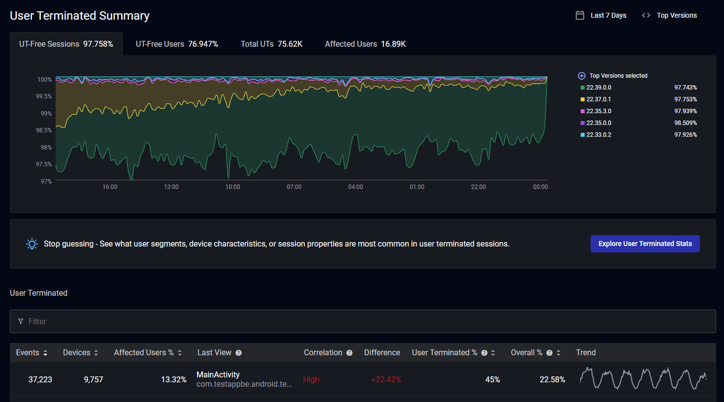
Let’s dive into the improvements. Like before, you have access to your user terminated-free sessions and user terminated-free users rates with a visualization for the given time period. We’ve added a table with a breakdown of user terminated-free sessions by version so you can easily spot regressions across releases.
We’ve also included several new metrics into this widget:
- Total user terminations for all versions selected in the given time period
- Users affected by user terminations for all versions selected in the given time period
- Visualization of user termination counts by version over time
- Breakdown of user termination counts by version
These count metrics complement the percentages, providing another level of visibility to inform decision-making.
New filtering on user terminated summary page
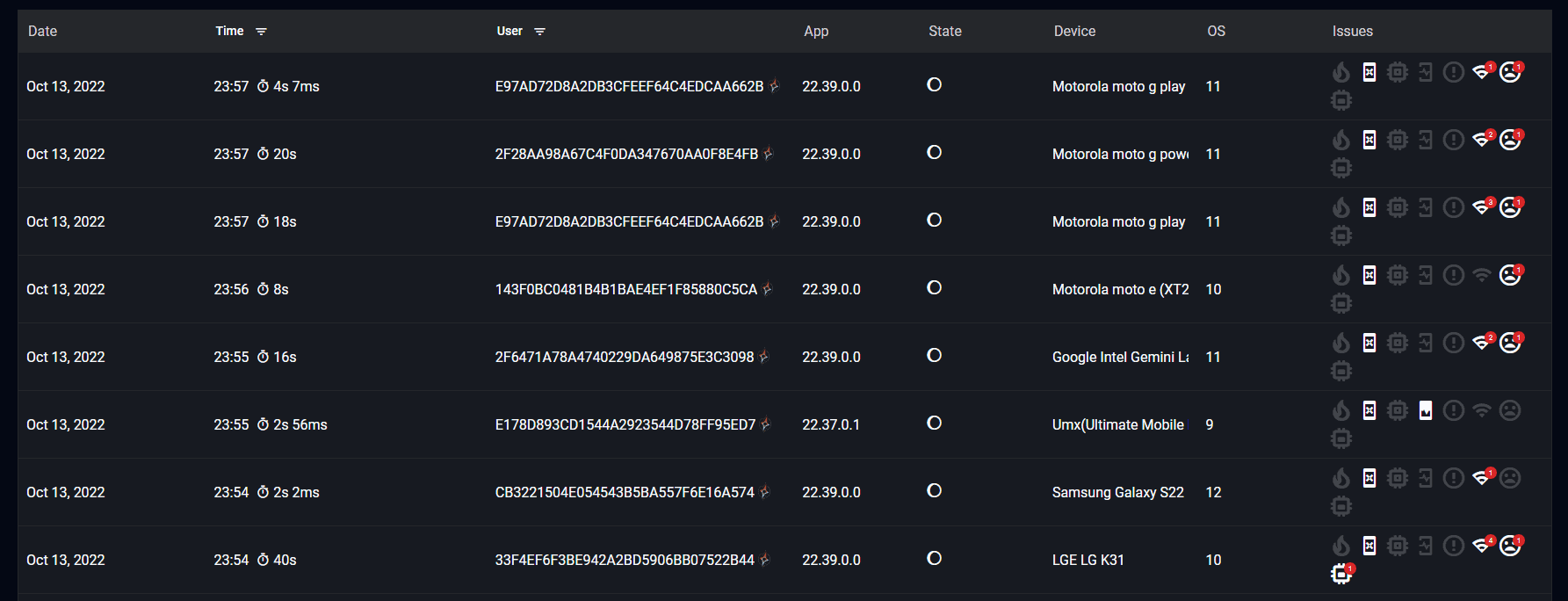
We’ve previously added powerful filtering to our User Sessions, Crash Summary, Log Summary, App Performance Summary, and OOM Summary pages to enable teams to drill down to the individual sessions, crashes, logs, app performance moments, and OOMs they care about. We’re proud to announce we’ve extended this functionality to our User Termination Summary page as well!
All you have to do is click in the input box, and you’ll be presented with categories and the corresponding options you can filter on. They include the following:
App
Build
Environment
Environment Detail
Last View
SDK Version
Device
Country
Model Factory Name
Jailbroken
Manufacturer
Model Name
Device Type
OS
OS Major Version
OS Version
User
Persona
Embrace ID
User ID
Username
User Email
Session
Session Property Key
Session Property Value
Has ANR
Has Crash
Has Low-Memory Warning
Has OOM
Has Cold Start
Is First
In the example above, we’ve added filters for OS major version and Country. Now we’ll see updated counts on user terminations that satisfy the following requirements:
- Has an OS major version of either 14 or 15
- Has a Country of US
The individual filters are ANDed together, but the values within a specific filter type are OR’d.
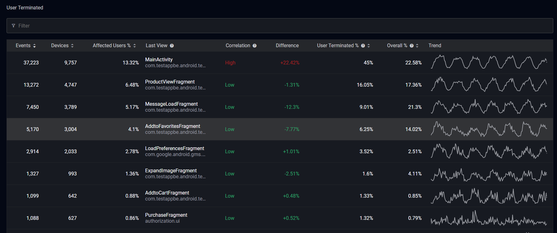
New sorting on user terminated summary page
Similar to the Crash and OOM Summary pages, the filter widget on the User Terminated Summary page can now be sorted on several columns. You can click the arrows on sort by the following categories:
- Event count
- Device count
- Affected users %
- User terminated % (the percentage of all user terminated sessions that end on the given view)
- Overall % (the percentage of all sessions that end on the given view)
When you are ready for more information about a specific user termination, click the corresponding row to head to the User Terminated Details page.

The new filtering on the user terminated details page
Our User Terminated Details page now has the same powerful filtering as the User Terminated Summary page. Your filters are persisted, and we have added two new metrics in the top widget:
- Percentage of affected users
- Count of affected devices
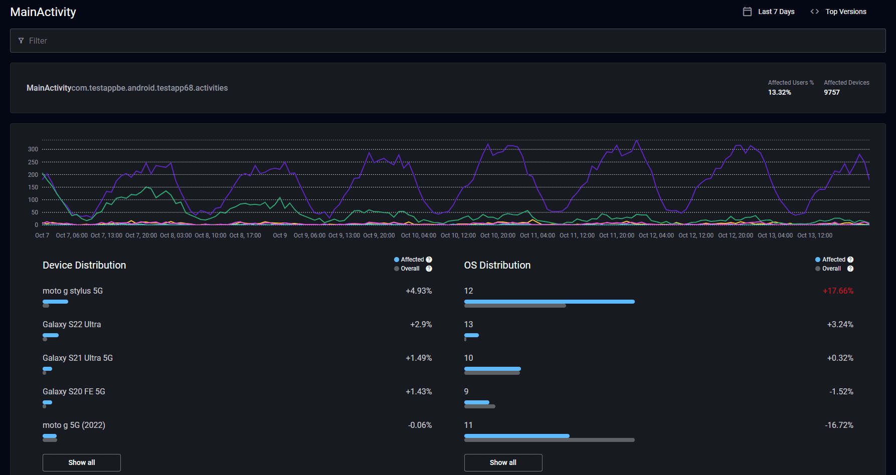
You can also refine your search with additional categories and then scroll down to inspect the most recent affected sessions to quickly spot patterns.
If you’d like to see distributions for your user termination data, you’ll follow the same path as you would for investigating Crash Stats, Log Stats, App Performance Stats, and OOM Stats by clicking on the “Explore User Terminated Stats” button from the User Terminated Summary page.
The new user terminated stats page
Similar to the User Terminated Details page, our new User Terminated Stats page will persist your filters. This page highlights where user terminations are over-indexed on certain attributes.
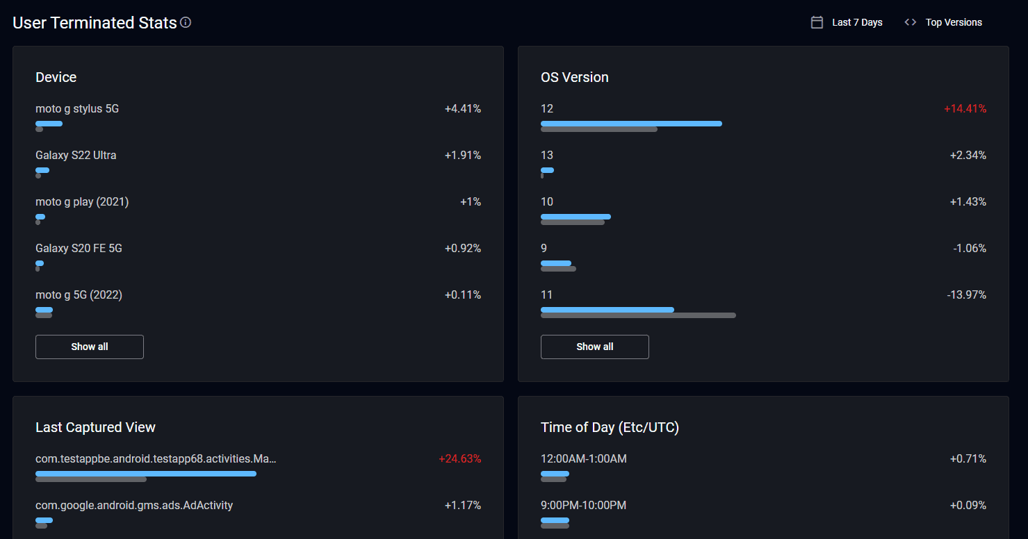
The widgets available are the following:
- Device – This shows which device the user termination happened on.
- OS Version – This shows which OS the user termination happened on.
- Last Captured View – This shows the view the user termination happened on.
- Time of Day (UTC) – This shows the time of day in UTC when the user termination happened.
- Session Properties – These show where user terminations happen in relation to predefined key-value pairs.
- Country – This shows the country the user termination happened in.
Here’s a quick primer on how to interpret this information:
- The blue line represents the proportion of total user terminations that occurred with the given attribute.
- The gray line represents the proportion of total sessions that occurred with the given attribute.
Large differences between the two lines indicate user terminations being over- or under-indexed by that attribute. These visualizations provide context about where user terminations might disproportionately affect subsets of your users. In extreme cases, user terminations that overwhelmingly affect a given attribute can guide your team towards a possible root cause involving that attribute.
And that’s it! We’ve redesigned our User Terminated Summary page and added filtering to our existing User Termination pages for quicker access to the data you’re interested in. We’ve also created a new User Terminated Stats page so you can check the distributions of your user terminations across various attributes in order to more easily spot patterns worth investigating.
As always, please share any feedback so we can continue to build features and improvements that help your team be successful.
How Embrace helps mobile teams
Embrace is a data driven toolset to help mobile engineers build better experiences. We are a comprehensive solution that fully reproduces every user experience from every single session. Your team gets the data it needs to proactively identify, prioritize, and solve any issue that’s costing you users or revenue.
Request a demo and see how we help teams set and exceed the KPIs that matter for their business!