

WEBINAR on JULY 14 | Honeycomb + Embrace: How to Close the Gap Between Frontend Experience & Backend Truth

Register now

New research: The Core Web Vitals thresholds you trust might be wrong for your site

I studied Core Web Vitals data for ten leading online retailers. The results challenge our assumptions about performance: "good" for Google may not be good enough for your users or your business.

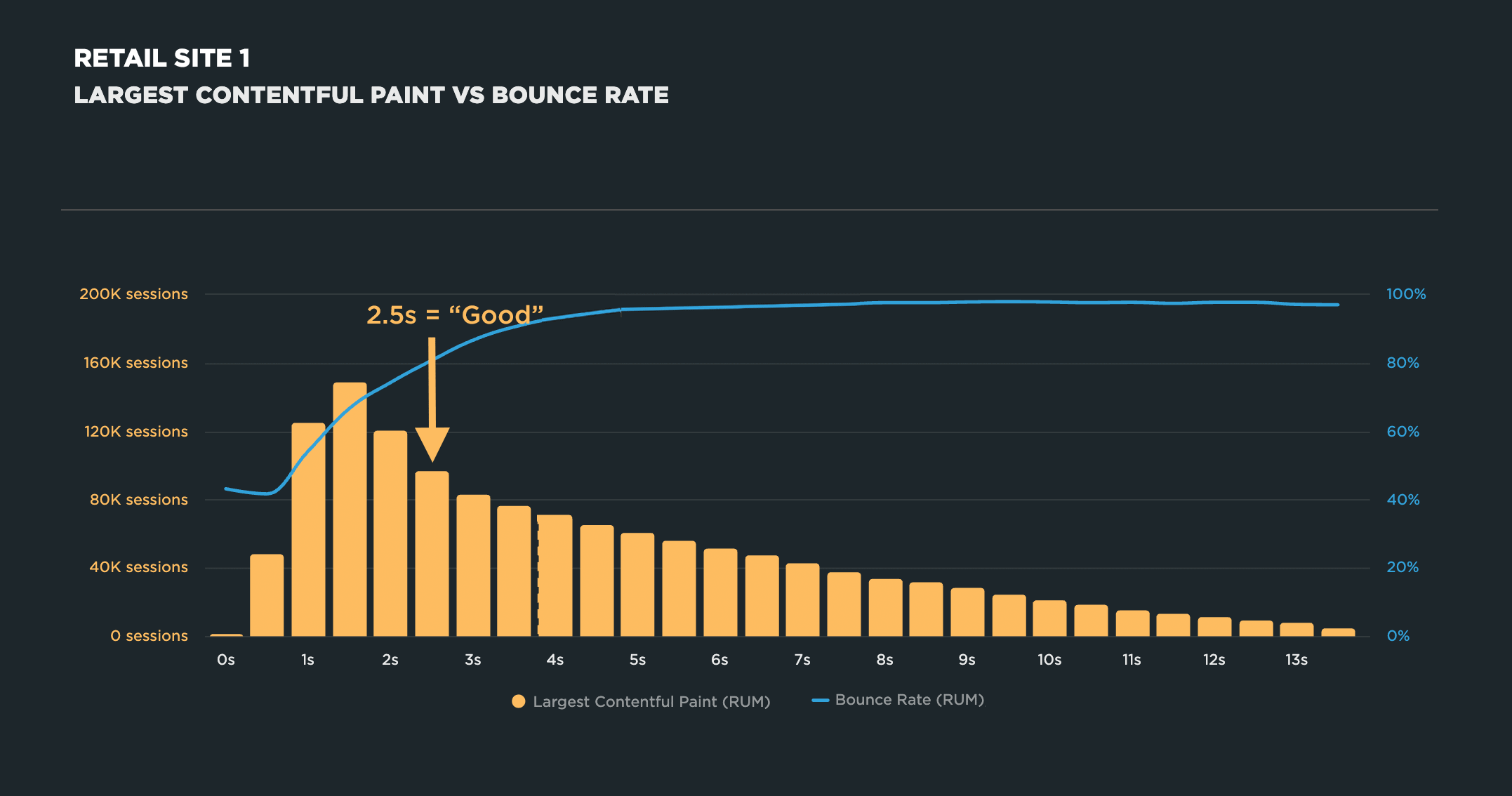
2.5 seconds is Google’s threshold for a “good” Largest Contentful Paint (LCP). It’s become the de facto finish line for a lot of teams. Hit it, get your green checkmark, pass Go, collect $200.

But that number is based on aggregated data across millions of sites. It tells you what’s fast in general. It knows nothing about your users, your product, or your business.

For the last couple of years, I’ve wondered if Google’s recommended thresholds are the right goals for individual sites. “The average site” and “your site” are two different things, and mixing them up is where a lot of folks risk going wrong.

(To be clear, I’m not questioning whether Core Web Vitals matter. They absolutely do. Over the years, I’ve built a lot of correlation charts – visualizations that show the relationship between performance metrics and business metrics – and the pattern holds up again and again: as user-oriented page-rendering metrics like LCP or Interaction to Next Paint (INP) gets slower, bounce rate climbs and conversion rate drops. That relationship is real.)

The research

I decided to dig into my questions properly. I pulled a month of real user data from ten leading online retailers and built a correlation chart for each one, plotting session-level Largest Contentful Paint (LCP) data against bounce rate for each site.

Before we get into the findings, first I want to cover what a performance correlation chart is and what it shows you.

A correlation chart is a powerful data visualization that shows you the relationship between your page speed metrics and your business and user engagement metrics.

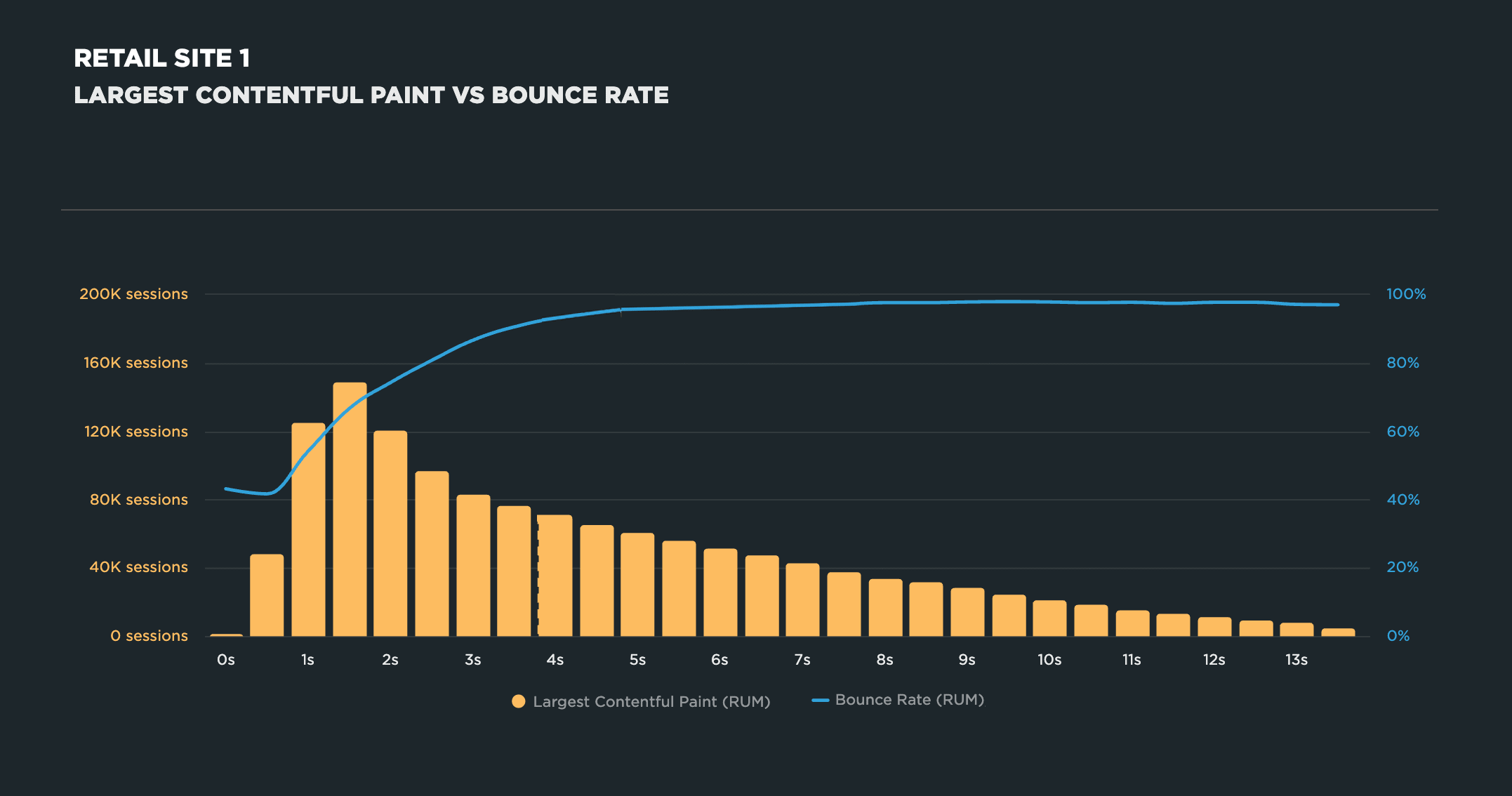
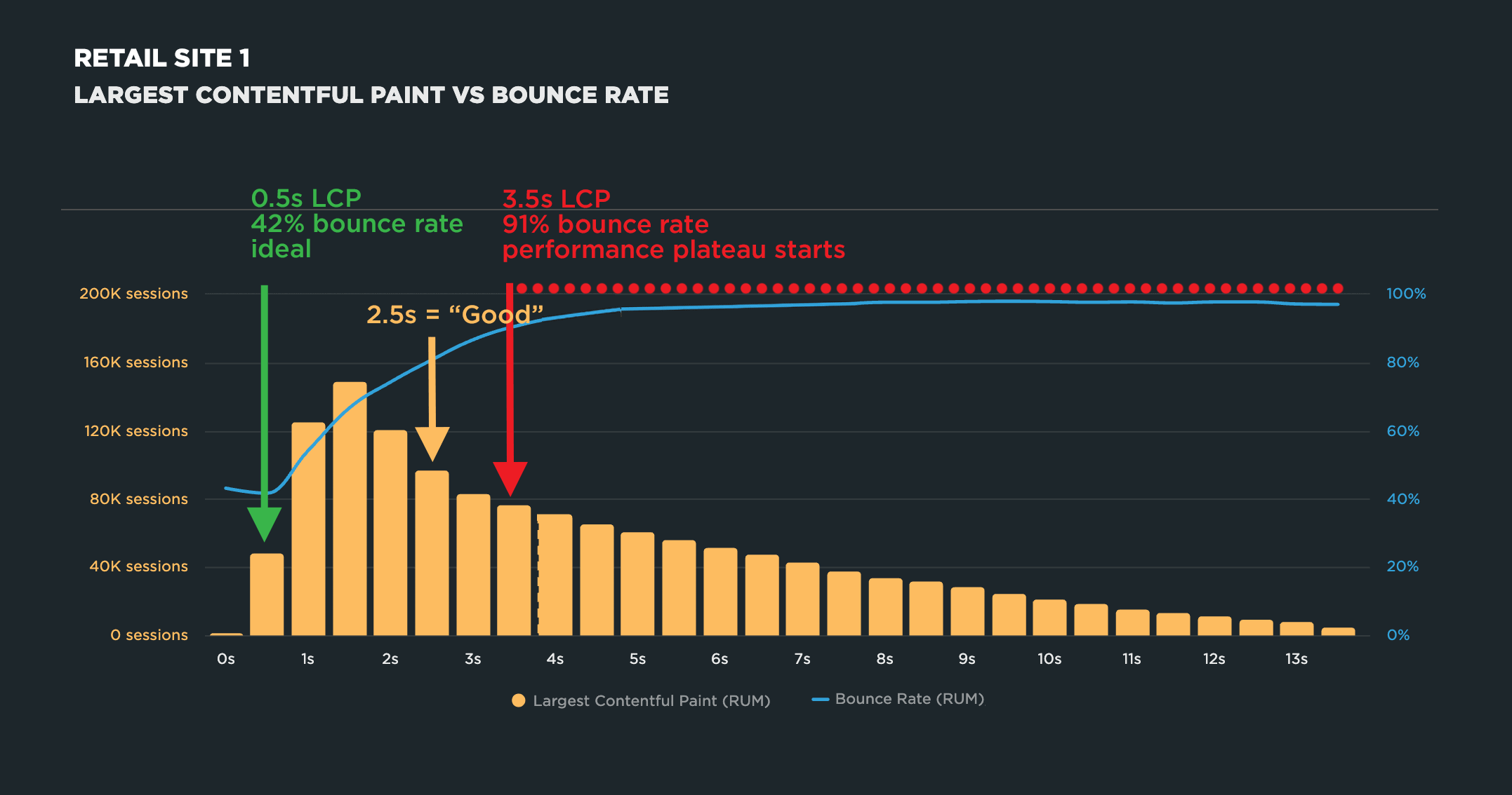
To illustrate, here’s the correlation chart for the first retail site in this research:

Correlation charts are generated using real user monitoring (RUM) data. They give you a histogram view of all your user traffic, broken out into cohorts based on performance metrics, such as Start Render, Largest Contentful Paint, Interaction to Next Paint, and more. Each cohort shows you the median time for whatever metric you’re tracking for the session. (Those cohorts are represented in the yellow columns in the chart above.)

The next layer of the chart is where things get really interesting.

You also get an overlay (the blue line in the chart above) that shows you the business or user engagement metric – commonly conversion rate or bounce rate, but there are many more – that correlates to each of these cohorts. This lets you see at a glance how closely your business/engagement metric aligns with the speed of your site.

For this investigation, I focused on bounce rate rather than conversion rate because it’s captured by default in most RUM tools, so there’s no extra instrumentation required. It’s also a good directional proxy. In my experience, if you see a relationship between a performance metric and bounce rate, there’s a good chance a similar relationship exists with conversion rate, too.

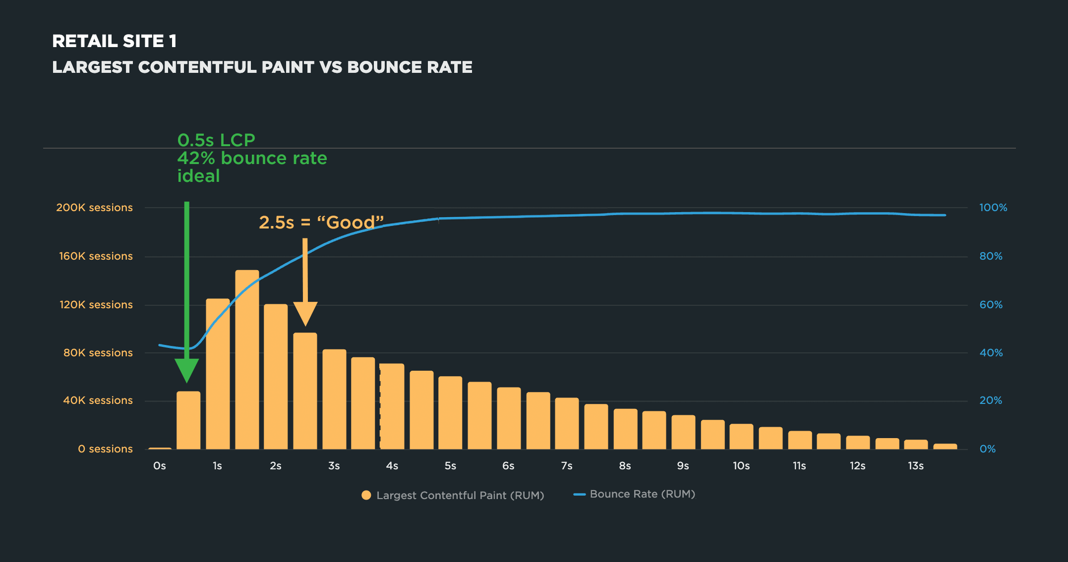
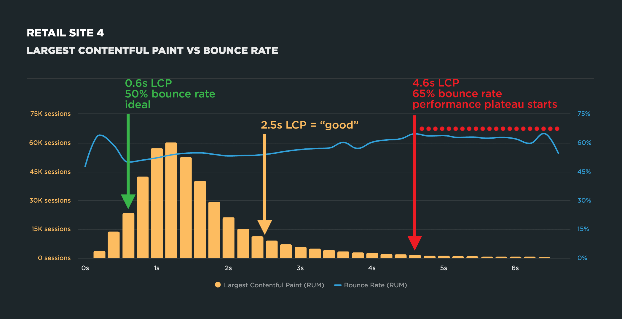
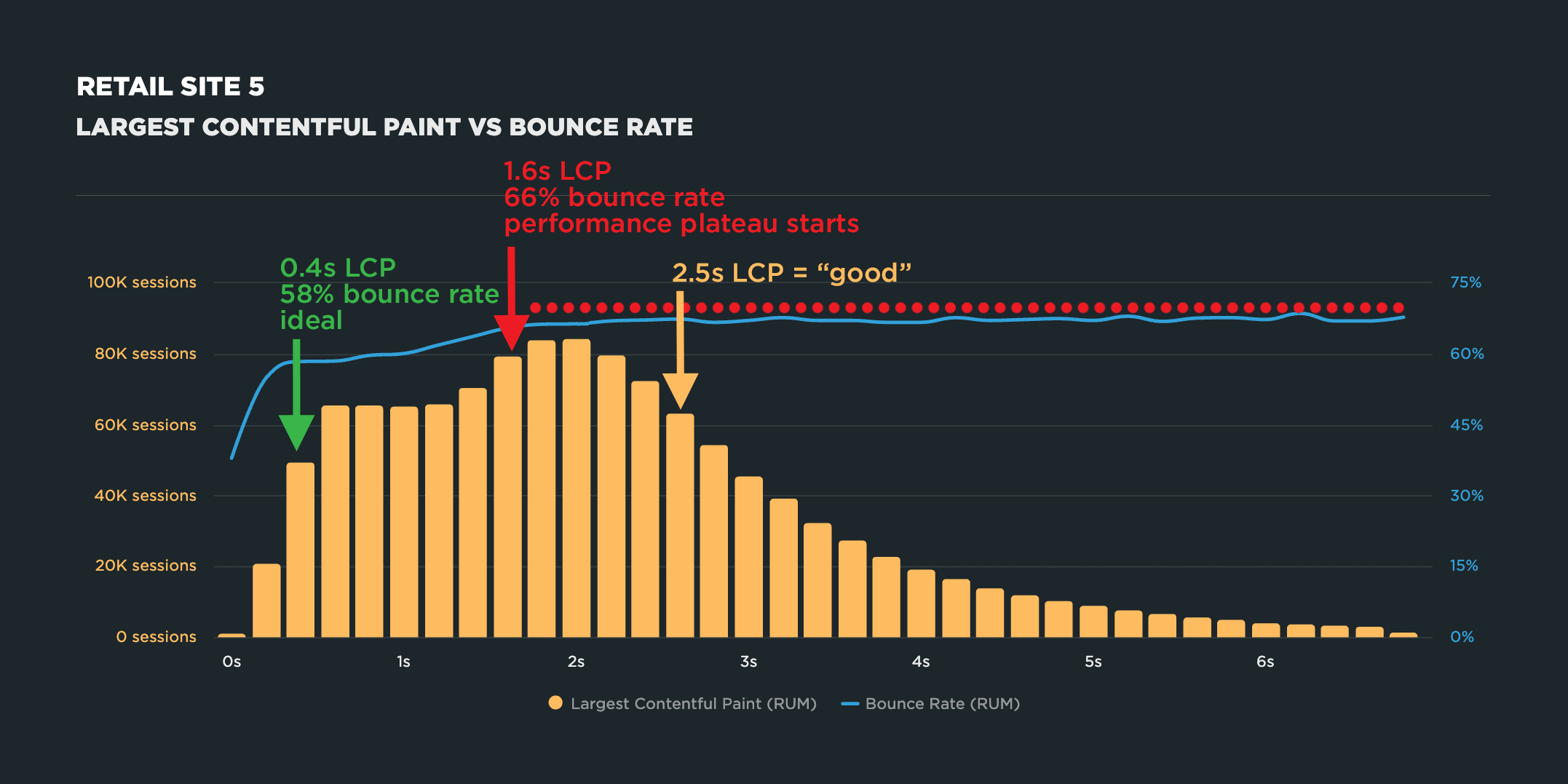
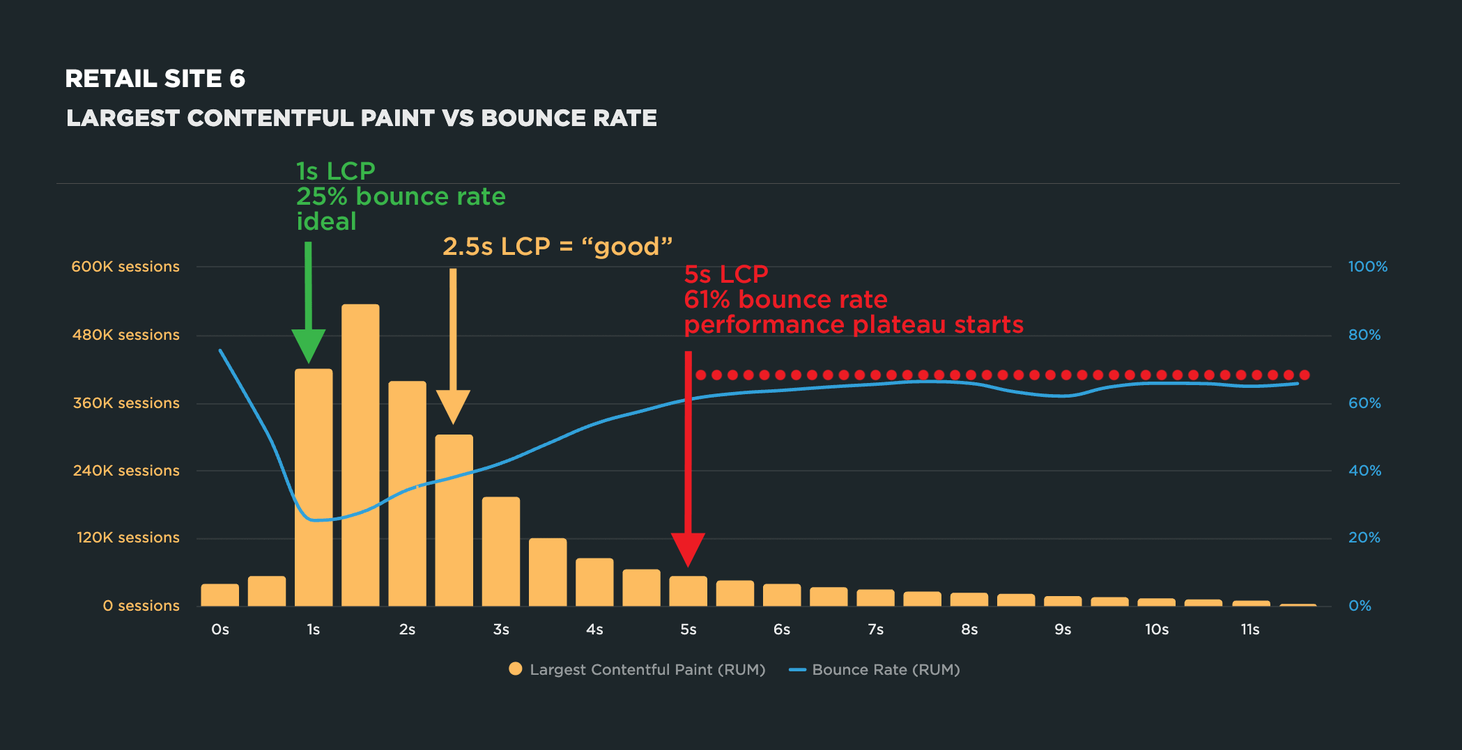
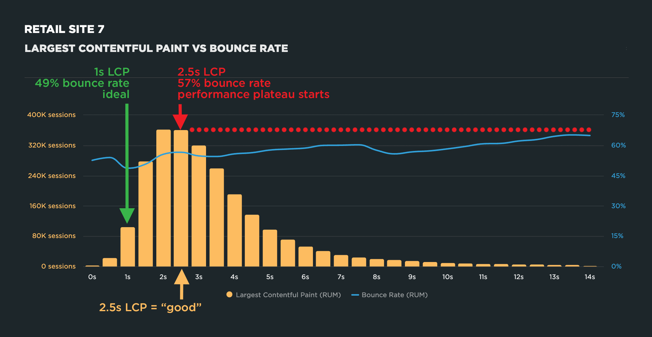
On the correlation chart for each site, I marked three points:

Ideal LCP: the speed at which bounce rate was at its best for this specific site
The performance plateau: the point where getting faster or slower doesn't make any difference to bounce rate

If you’re not familiar with the performance plateau, I’ve written about it before. Short version: every site eventually hits a point where shaving off more milliseconds stops moving the needle on engagement. Below that point, speed matters a lot. Beyond it, you’re optimizing for nothing.

Finding 1: Optimal LCP ranged from 100ms to 1s

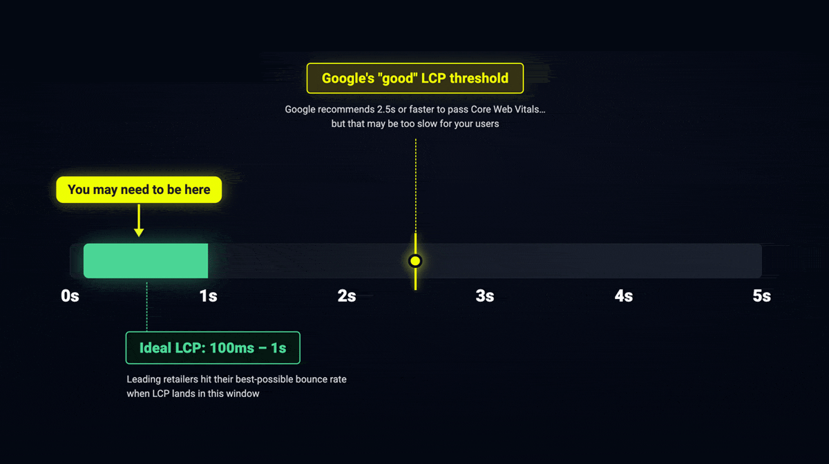
Across all ten retailers, the optimal LCP — the point tied to the best bounce rate — ranged from 100 milliseconds to 1 second.

Not 2.5 seconds.

Every one of these sites saw its best engagement well before Google’s “good” threshold. For several sites, 2.5 seconds was already sitting on the plateau – the zone where speed had stopped helping long before.

I want to emphasize this before I go on: this is NOT a new number for you to chase. 100ms–1s isn’t a universal target any more than 2.5 seconds is. That’s exactly the trap we’re trying to avoid. What it tells you is that “good enough” – for real users on real sites – can be much faster than the industry standard suggests. The only way to know your number is to look at your own data.

Finding 2: 4 out of 10 sites hit the performance plateau BEFORE 2.5s

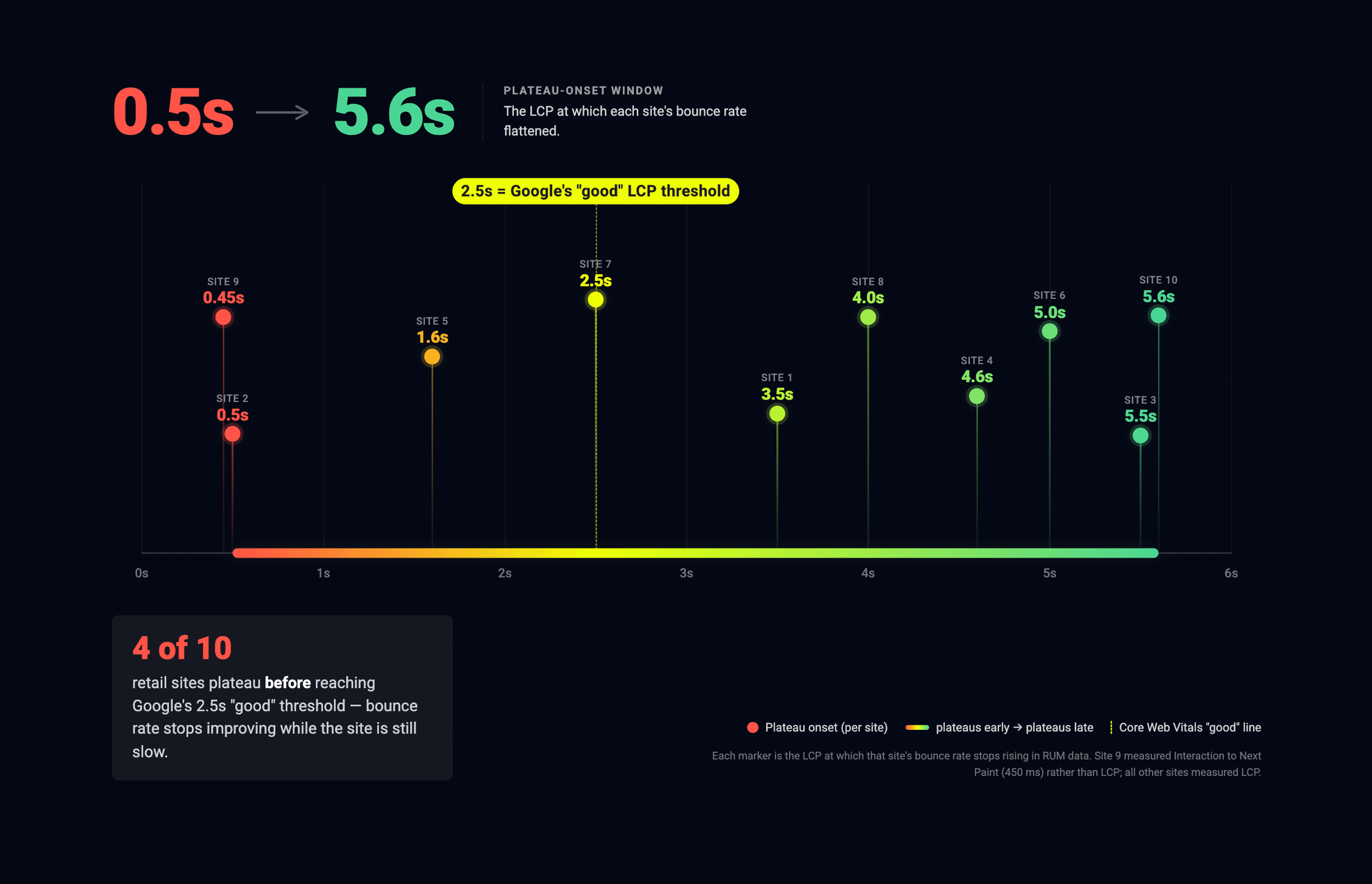
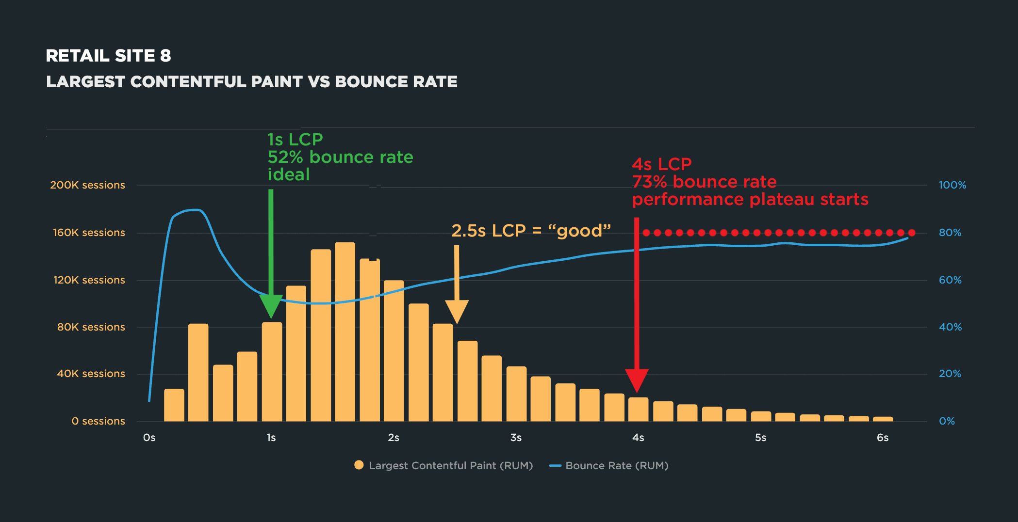
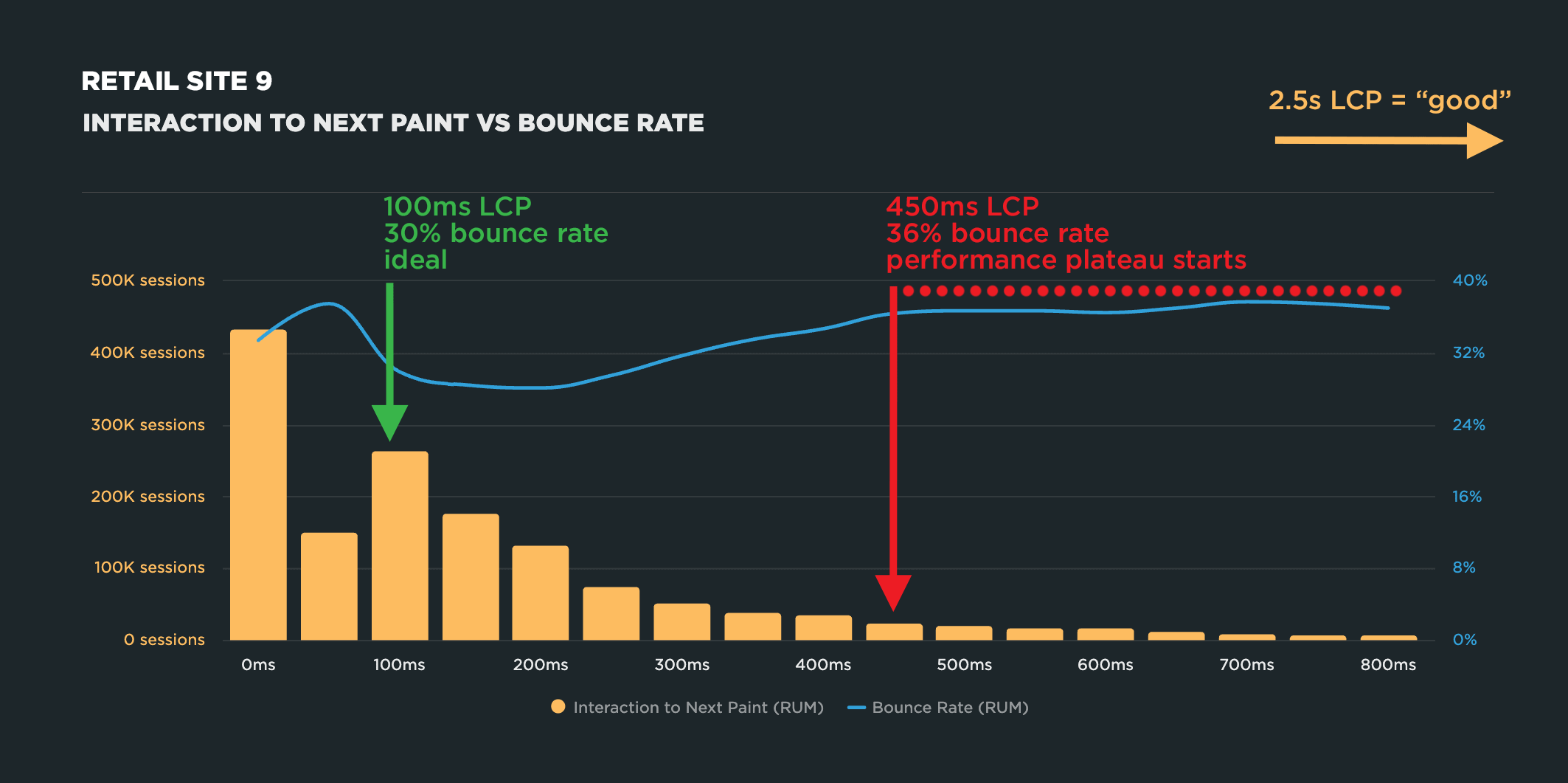
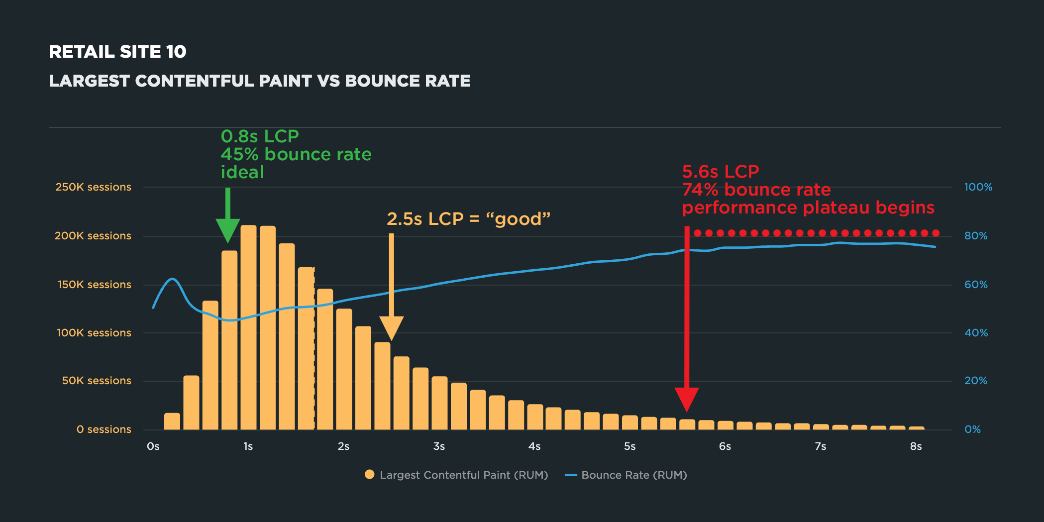
The start time for the performance plateau ranged from 500 milliseconds to 5.6 seconds across all ten sites. This wasn’t surprising. There’s typically a lot of variance in how the performance plateau manifests across different sites.

What was surprising was that, for four of the ten sites, the performance plateau started before 2.5 seconds. By the time those four sites met Google’s recommended threshold for “good” Largest Contentful Paint time, they were already on the performance plateau.

In other words, even though these four sites are technically fast enough for Google, they’ve actually bottomed out in terms of bounce rate.

At the risk of repeating myself (but it bears repeating), you should never assume that meeting external thresholds is actually helping your business. You need to look at your own data to set meaningful targets.

The charts

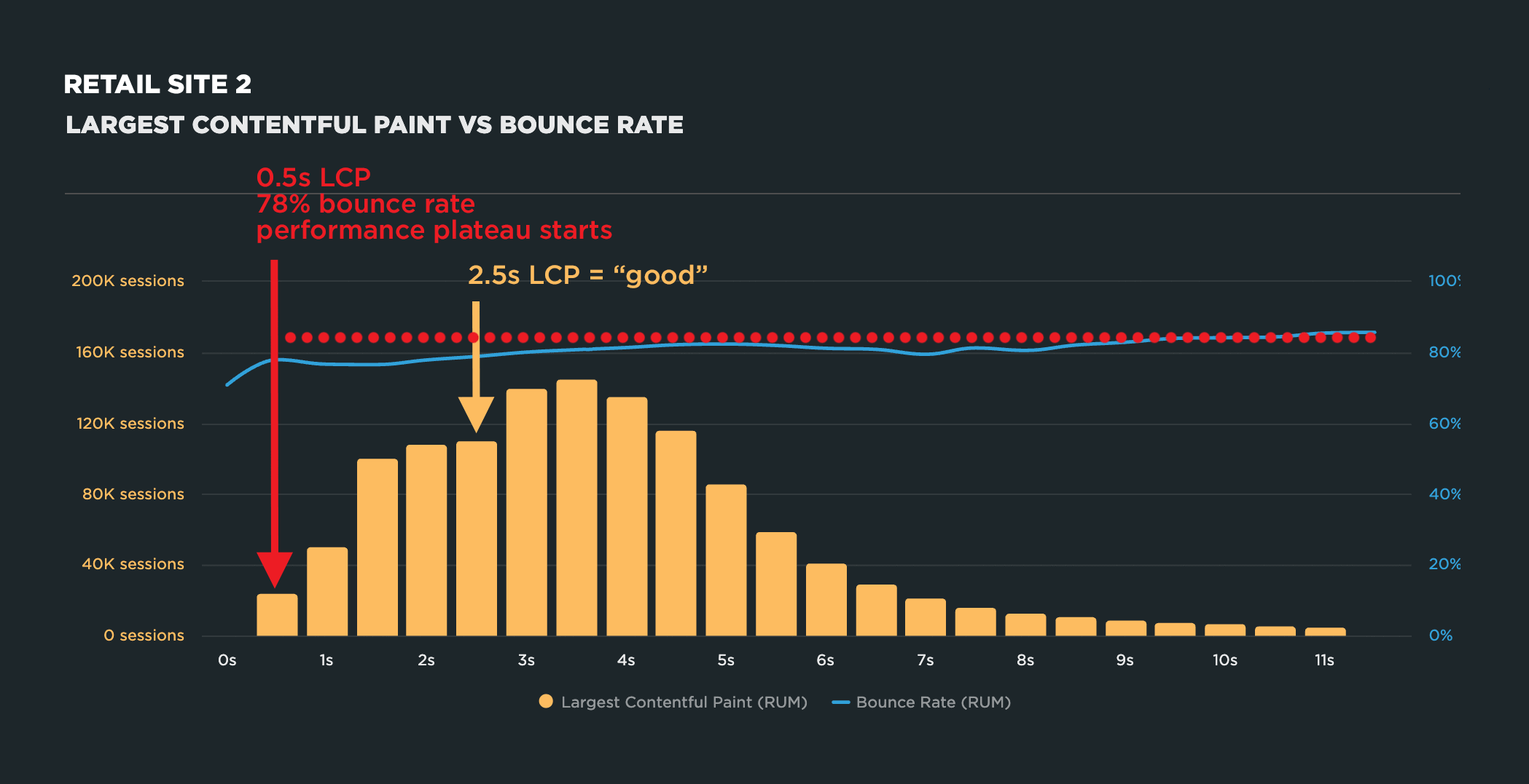
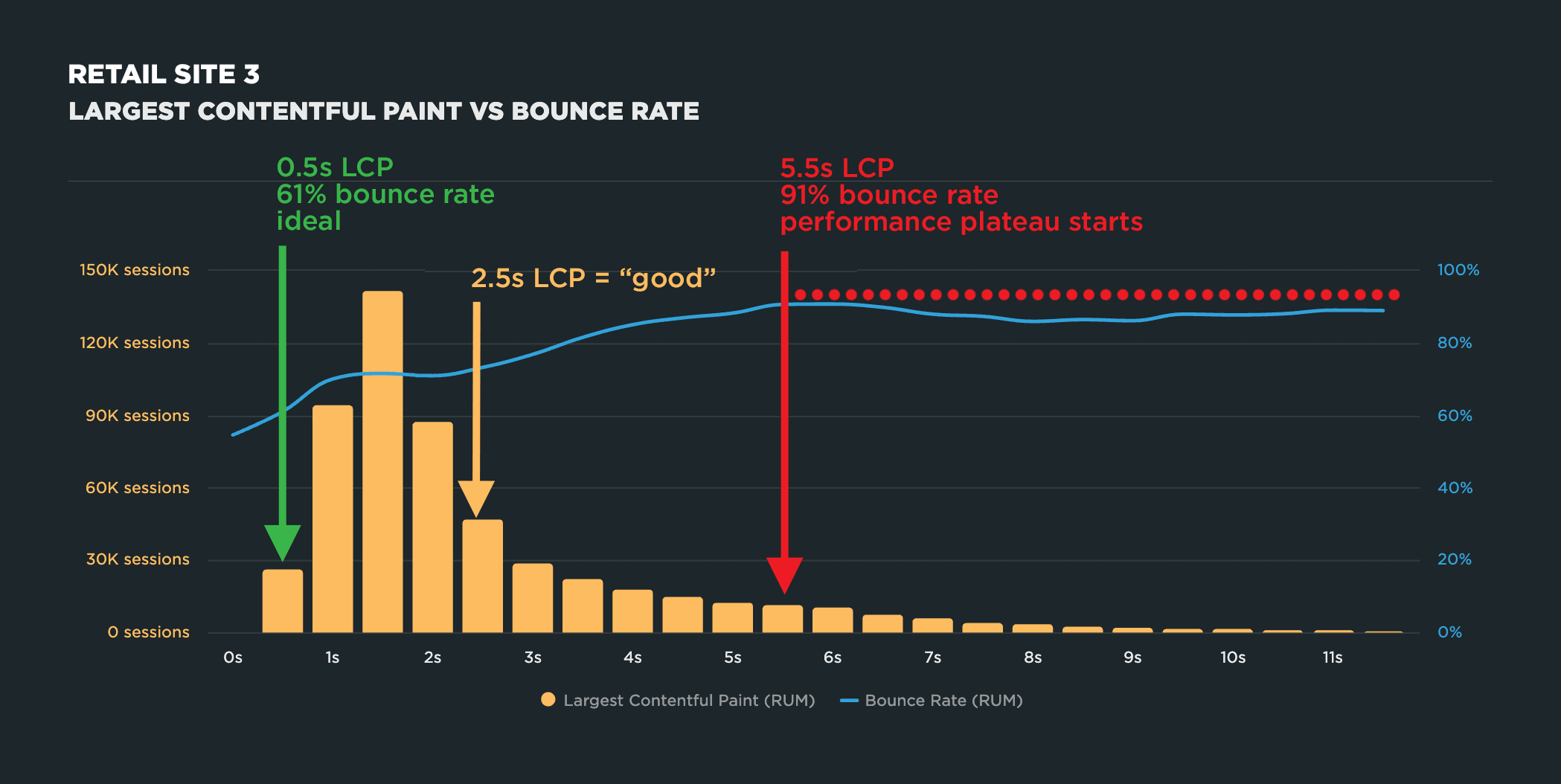
Below, I’m sharing the correlation chart for each of the ten retailers, along with what stood out in each one: where the optimal LCP landed, where the plateau began, and anything else worth noting about the shape of the curve.

To be completely candid, even though I hypothesized these results, I was surprised at how consistent they were.

What can you do with these findings?

It’s tempting to look at “100 milliseconds to 1 second” and treat it as a new target to chase. Please, please don’t. As I mentioned earlier, that’s exactly the trap we’re trying to avoid. Consider this research a methodology, not a number.

The good news is that the method is straightforward:

  1. Pull your own RUM data.
  2. Build a correlation chart plotting LCP (or any other user-oriented metric) against bounce rate.
  3. Find where your bounce rate is actually at its best, and where your plateau begins.
  4. Set your performance goals based on that – not on a number based on millions of sites you don’t run.

Your optimal LCP might turn out to be 1.8 seconds. It might be 400 milliseconds. It might be 5 seconds. Who knows! There’s no way to know without looking. But if these ten retailers are any indication, “fast enough” may be faster than the industry standard suggests. Treating 2.5 seconds as your finish line could mean leaving engagement and revenue on the table without realizing it.

If you run this analysis on your own site, I’d love to hear what you find! If you’re an Embrace/SpeedCurve customer and you want to know how to do your own investigation, let me know and I’ll be happy to help.

Embrace Deliver incredible mobile experiences with Embrace.

Get started today with 1 million free user sessions.

Get started free
Related Content